Posted:October 22, 2020

Notebooks are Only Interactive if You Share

We first began publishing interactive electronic notebooks for this Cooking with Python and KBpedia series in CWPK #16, though the first installment using a notebook started with CWPK #14. I had actually drafted all of the installments up to this one before that date was reached. Since one major purpose of this series was to provide hands-on training, I did not want to force those who wanted to experience some degree of interactivity to have to go through all of the steps to set up their own interactive environment. My hope was that a taste of direct involvement with the code and interactivity would itself encourage users to get more deeply involved to establish their own interactive environments.

I had encountered for myself fully interactive notebooks prior to this point, ones where all I needed to do was to click to operate, so I knew there must be a way to make my own notebooks similarly available. In order to achieve my objective, as is true with so much of this series, I was forced to do the research and discover how I could set up such a thing.

A Survey of the Options

In researching the options it was clear that a spectrum of choices existed. We have already discussed how we can create non-interactive mockups of an interactive notebook using the nbconvert option or converting a drafted notebook using Pandoc (CWPK #15). My research surfaced some additional options to render a notebook page for general Web (HTML) display:

Static Options

  1. nbconvert, but lose interactivity
  2. The Pandoc option
  3. Publish in other formats (PDF)
  4. View a non-interactive page via nbviewer by simply providing a URL, which works like nbconvert.

These options are helpful, of course, but lack the full interactivity desired.

Fully Interactive

Systems that allow code cells to be run interactively are obviously more complex than nice rendering tools. My investigations turned up a number of online services, plus ways to set up own or private servers. From the standpoint of online services, here are the leading options:

There is a Python option that does not provide complete interactivity, but simple interactions of certain aspects of certain notebook cells:

  1. nbinteract is a Python package that provides a command-line tool to generate interactive web pages from Jupyter notebooks

Then, there are a series of online services:

  1. The MyBinder option, which uses a JupyterHub server directly from a Git repository
  2. Google’s Colaboratory, which provides a Google flavor on this approach
  3. Microsoft’s Azure Notebooks, which provides a MS flavor on this approach
  4. There are other sites such as Kaggle Kernels, CoCalc, nanoHUB, or Datalore that also provide such services, some for a fee.

The other interactive approach is to not use an established service, but to set up your own server.

  1. For private repositories, one can build on BinderHub, the same technology used by MyBinder, and which runs on JupyterHub running on Kubernetes for most of its functionality, or
  2. One can run a public notebook server based on Jupyter, though it is limited to a single access user at a time, or
  3. Set up one’s own JupyterHub, similar to the BinderHub option but not limited to a Git repository.

Frankly, most of the own-server options looked to be too much work simply to support my educational objectives for the CWPK series.

The Chosen MyBinder Option

I was very much committed to have an online service that would run my full stack. I chose to implement the MyBinder option because I could see it worked and was popular, it had close ties to Jupyter and rendered notebooks the same as when using locally, was free, and seemed to have strong backing and documentation. On the other hand, MyBinder has some weaknesses and poses some challenges. Some of the key ones I knew going in or identified as I began working with the system were:

  • As a hosted service that runs its applications in containers, it could take some minutes to get the online service active when used after a hiatus, necessary to reconfigure the container specific to the application and Python modules being used
  • It reportedly has memory limitation of 1-2 GB. Memory can be an issue with CWPK locally even at the 8 GB level
  • The service needed to run off of a Git repo. I had plans to better expose all aspects of the CWPK series and its supporting software on our existing public GitHub repository; the Git requirement caused me to accelerate my exposure of this service
  • Though free now, each MyBinder application is a rather large consumer of resources. I have some concerns regarding the longer-term availability of the service
  • CWPK would have more than 60 interactive notebook pages, though I did see reference that performance issues may only arise due to multiple, concurrent use. Going in, I had no clue as to what the use factor might be for the service and whether this would pose a problem or not.

Some of these issues deserve their own commentary below.

Setting Up the Environment

Setting up a new instance at the MyBinder service is relatively straightforward. Here is the basic set-up screen on the main page:

Setting Up a New MyBinder Project
Figure 1: Setting Up a New MyBinder Project

One must first have a Git repository available to start the service. One also needs to have completed an environment configuration file (environment.yml in our case with Python) and a project README.md at the root of the master branch on the repo. In our case, it is the CWPK repository on GitHub; we also indicate we are dealing with the master branch (1). (I had some initial difficulty when I over-specified a link to an individual notebook page; removing this cleared things up.) These simple specifications create the URL that is the link to your formal online project (2). Upon launch (3), the build process is shown to screen (4), which may take some minutes to build. The set of working input specs also provide the basis for generating a link badge you can use on your own Web sites (5).

Upon completion of a successful build, one is shown the standard Jupyter Notebook entry page.

Here are two additional resources useful to setting up a MyBinder application for the first time:

Implementation Challenges

Though set up is straightforward, there are some challenges in implementing MyBinder to accommodate specific CWPK needs. Here are some of the major areas I encountered, and some steps to address them.

Importing Local Code

As has become obvious in our series to date, Python is a highly configurable environment, with literally tens of thousands of packages to choose from to invoke needed functionality. The standard environment settings appear to do a good job of allowing new packages to be specified and imported into the MyBinder system. I had confidence these could be handled appropriately.

My major concern related to CWPK‘s own cowpoke package. At the time of starting this effort, this package was not commercial grade and was not registered on major distribution networks like PyPi or conda-forge. When used locally, including cowpoke is not a big issue: we only need to include it in the local listing of site packages. But, once we rely on a cloud instance, how can we get that code into our online MyBinder system?

The answer, it turns out, is to package our code as one would normally do for a commercial package, and then to include a setup.py configuration file in our local specification. That enables us to invoke the package through the standard MyBinder environment configuration. See especially this key reference and this stub for setup.py.

Local Data Sharing and Organization

Until this point, I had been developing and refining a local file directory structure in which to put different versions of KBpedia, other input files, and example outputs. This system was being developed logically from the perspective of a local file system.

However, these files were local and not exposed for access to an online system like MyBinder. My first thought was to simply copy this structure to the GitHub repo. But the manual copying of files to a version control system is NOT efficient, and the directory structure itself did not appear suitable for a repo presence. Further, manually copying files presents an ongoing issue of keeping local and remote versions in sync. Moreover, as I began adding new daily installments to the GitHub repo, I could see in general that manual additions were not going to be sustainable.

These realizations forced two decisions. First, I would need to re-think and re-organize my directory structures to accommodate both local and repo needs. The directory structure we have developed to date now reflects this re-organization. Second, as described in the next section, I needed to cease my manual use of GitHub and fully embrace it as a version control system.

Fully Embracing GitHub

I have to admit: Every time I try to work with version control with Git, I have been confused and frustrated with how to actually get anything done. I have, hopefully, progressed a bit beyond this point, but I would caution some of you looking to move into this area that you may have to overcome poor documentation and obfuscated instructions and commands.

So, I will not divert this series to deal with how to properly set up a Git-based version control system. In brief, one needs to establish a Git repository, and on Windows set up a Git client and then (for me), set up TortoiseGit if you want to work directly in Windows and the File Explorer rather than from the command line. In the process of doing all of this, you will also need to set up a key-based access control system with PuTTy (puttygen) so that you can communicate securely between your remote instance and your local file system. These steps are more effectively described in the TortoiseGit manual or various tutorials of one aspect or another. Installation, too, can be difficult with regard to general aspects or the PuTTy keys.

The reason, of course, for accepting this set-up complexity is being able to make changes either on a local version of code or data or a remote version of the same. This is the essence of the definition of keeping systems in ‘sync’. After having worked with these systems now for some weeks, daily, I think I can offer some simple tips for how best to work with these version control systems, points which are not obvious from most written presentations:

  1. First, make sure both the remote and local sources are in sync (this is actually not such an easy point, and is often the point of failure and frustration. However, until this status of being in sync is met, none of the other points below are possible.) When working locally, it is good practice to ‘pull’ any changes first from the remote repository before you attempt to ‘push’ local changes back to it. If you run into problems at this initial point, you need to research and find a fix before moving on
  2. Remember that your version control can really only occur from the local side, where your TortoiseGit is installed. So, while changes may occur either in the remote or local repository, the control to keep things in sync will occur from the local side (TortoiseGit)
  3. Whether at the remote or local repository, make all needed changes there, including deleting files, adding files, or modifying files. Then, commit those changes to the repository at hand (local or remote). (On TortoiseGit locally, this is done via the ‘Add’ Explorer menu option for new files; use the ‘Check for modifications’ option for changed files.) Commitment to the repository at hand is needed before the version control system knows what has been formally modified
  4. Again, be cognizant of where the modifications have occurred, which in any case you will control from the local TortoiseGit. If the changes have been made locally, then ‘push’ those changes to the remote repository; if the changes have been made remotely, then ‘pull’ those changes changes back to the local.

Always make sure that as any changes are made, at either side, they are synced to the system. In this way, you can be assured that your version control system is in a stable state, and you are free to make changes on either the local or remote side. Also know you can use GitHub for keeping multiple local instances (a desktop and a laptop in my case) in sync with the remote repository. Simply follow the above guidelines for each instance.

Handling Styles (CSS)

If you recall the discussion in CWPK #15, there is a difference in where custom styles can be set when viewing notebook pages locally versus whether they are called up directly from Python. Now, as we move to an online expression of these notebooks, we again raise the question of where online custom styles can be invoked.

Perhaps in some expressions, where style overrrides can be invoked is a matter of little consequence. But this CWPK series has some specific styles in such things as pointing to warnings, pointing to online resources, etc. Having a consistent way to refer to these styles (presentation) means better efficiency.

My hope had been that with MyBinder we had some identifiable means for providing such custom.css overrides as well. Though I can see links to such in page views, and there are hints online for how to actually modify styles, I was unable to find any means for effectively doing so. My suspicion is that online interactivity such as MyBinder is still in its infancy, and the degree of control that we expect in either local or remote environments is not yet mature.

Thus, since I could find no way after many frustrating hours to provide my own specific styles, I had to make the reluctant decision to embed all such style changes in each individual notebook page. (What this means, effectively, is the specific statement of style attributes needs to be repeated each time as used [MyBinder does not support referring to a style name in a separate external file, which is the more efficient alternative].) This embedded approach is not efficient, but, like prior discussions about the use of relative addresses, sometimes being specific is the best way to ensure consistent treatment across environments.

Using MyBinder

As time has gone on, I now have learned a general workflow that reflects these realities. In general, thus, with each new CWPK installment I try to:

  1. Draft all material in the Jupyter Notebook; make sure that version embodies all desired content and style changes and updates
  2. Inspect all link references and style definitions to make sure they are absolute, and not referenced
  3. Make sure all external files and images are moved and stored on the repository systems
  4. Post the updated file to the its current repository, and then commit it
  5. Push the updated file to the remote (or local) repository
  6. Convert the *.ipynb to HTML and post on my local blog
  7. Mix and stir again.

Though it is not designed directly as such, it is also possible to analyze use of MyBinder and gain statistics of use.

Additional Documentation

NOTE: This article is part of the Cooking with Python and KBpedia series. See the CWPK listing for other articles in the series. KBpedia has its own Web site. The cowpoke Python code listing covering the series is also available from GitHub.
NOTE: This CWPK installment is available both as an online interactive file or as a direct download to use locally. Make sure and pick the correct installment number. For the online interactive option, pick the *.ipynb file. It may take a bit of time for the interactive option to load.
I am at best an amateur with Python. There are likely more efficient methods for coding these steps than what I provide. I encourage you to experiment — which is part of the fun of Python — and to notify me should you make improvements.

Posted by AI3's author, Mike Bergman Posted on October 22, 2020 at 11:17 am in CWPK, KBpedia, Semantic Web Tools | Comments (0)
The URI link reference to this post is: https://www.mkbergman.com/2406/cwpk-57-publishing-interactive-notebooks/
The URI to trackback this post is: https://www.mkbergman.com/2406/cwpk-57-publishing-interactive-notebooks/trackback/
Posted:October 21, 2020

Working Examples are Not so Easy to Come By

Today’s installment in our Cooking with Python and KBpedia series is a great example of how impressive uses of Python can be matched with frustrations over how we get there and whether our hoped-for desires can be met. The case study we tackle in this installment is visualization of the large-scale KBpedia graph. With nearly 60,000 nodes and about a quarter of a million edge configurations, our KBpedia graph is hardly a toy example. Though there are certainly larger graphs out there, once we pass about 10,000 nodes we enter difficult territory for Python as a performant language. We’ll cover this topic and more in this installment.

Normally, what one might encounter online regarding graph visualization with Python begins with a simple example, which then goes on to discuss how to stage the input data and then make modifications to the visualization outputs. This approach does not work so well, however, when our use case scales up to the size of KBpedia. Initial toy examples do not provide good insight how the various Python visualization packages may operate at larger scales. So, while we can look at example visualizations and example code showing how to expose options, in the end whether we can get the package to perform requires us to install and test it. Since our review time is limited, and we have to in the end produce working code, we need a pretty efficient process of identifying, screening, and then selecting options.

Our desires for a visualization package thus begin with the ability to handle large graphs, including graph analytic components in addition to visualization, compatibility with our Jupyter Notebook interactive environment, ease-of-learning and -implementation, and hopefully attractive rendering of the final graph. From a graph visualization standpoint, some of our desires include:

  • Attractive outputs
  • Ability to handle a large graph with acceptable rendering speed
  • Color coding of nodes by SuperType
  • Varying node sizes depending on the importance (in-degree) of the node
  • Control over the graphical elements of the display (edge and node styles)
  • Perhaps some interactivity such as panning and zooming and tooltips when hovering over nodes, and
  • A choice of a variety of graph layout options to gauge which best displays the graph.

Preferably, whatever packages work best for these criteria also have robust supporting capabilities within the Python data science ecosystem. To test these criteria, of course, it is first necessary to stage our graph in an input form that can be rendered by the visualization package. This staging of the graph data is thus where we obviously begin.

Data Preparation

Given the visualization criteria above, we know that we want to produce an input file for a directed graph that consists of individual rows for each ‘edge’ (connection between two nodes) consisting of a source node (subclass), a target node to which it points (the parent node), a SuperType for the parent node (and possibly its matching rendering color), and a size for the parent node as measured by its number of direct subclasses. This should give us a tabular graph definition file with rows corresponding to the individual edges (subclasses of each parent) by sometime like these columns:

  RC1(source)     RC2(target)     No Subclasses(weight)     SuperType     ST color  

Different visualization packages may want this information in slightly different order, but that may be readily accomplished by shifting the order of written output.

Another thing I wanted to do was to order the SuperTypes according to the order of the universal categories as shown by kko-demo.n3. This will tend to keep the color ordering more akin to the ordering of the universal categories (see further CWPK #8 for a description of these universal categories).

It is pretty straightforward to generate a listing of hex color values from an existing large-scale bokeh color palette, as we used in the last CWPK installment. First, we count the number of categories in our use case (72 for the STs). Second, we pick one of the large (256) bokeh palettes. We then generate a listing of 72 hex colors from the palette, which we can then relate to the ST categories:

from bokeh.palettes import Plasma256, linear_palette

linear_palette(Plasma256,72)

We reverse the order to go from lighter to darker, and then correlate the hex values to the SuperTypes listed in universal category order. Our resulting custom color dictionary then becomes:

cmap = {'Constituents'           : '#EFF821',
'NaturalPhenomena' : '#F2F126',
'TimeTypes' : '#F4EA26',
'Times' : '#F6E525',
'EventTypes' : '#F8DF24',
'SpaceTypes' : '#F9D924',
'Shapes' : '#FBD324',
'Places' : '#FCCC25',
'AreaRegion' : '#FCC726',
'LocationPlace' : '#FDC128',
'Forms' : '#FDBC2A',
'Predications' : '#FDB62D',
'AttributeTypes' : '#FDB030',
'IntrinsicAttributes' : '#FCAC32',
'AdjunctualAttributes' : '#FCA635',
'ContextualAttributes' : '#FBA238',
'RelationTypes' : '#FA9C3B',
'DirectRelations' : '#F8963F',
'CopulativeRelations' : '#F79241',
'ActionTypes' : '#F58D45',
'MediativeRelations' : '#F48947',
'SituationTypes' : '#F2844B',
'RepresentationTypes' : '#EF7E4E',
'Denotatives' : '#ED7B51',
'Indexes' : '#EB7654',
'Associatives' : '#E97257',
'Manifestations' : '#E66D5A',
'NaturalMatter' : '#E46A5D',
'AtomsElements' : '#E16560',
'NaturalSubstances' : '#DE6064',
'Chemistry' : '#DC5D66',
'OrganicMatter' : '#D8586A',
'OrganicChemistry' : '#D6556D',
'BiologicalProcesses' : '#D25070',
'LivingThings' : '#CF4B74',
'Prokaryotes' : '#CC4876',
'Eukaryotes' : '#C8447A',
'ProtistsFungus' : '#C5407D',
'Plants' : '#C13C80',
'Animals' : '#BD3784',
'Diseases' : '#BA3487',
'Agents' : '#B62F8B',
'Persons' : '#B22C8E',
'Organizations' : '#AE2791',
'Geopolitical' : '#A92395',
'Symbolic' : '#A51F97',
'Information' : '#A01B9B',
'AVInfo' : '#9D189D',
'AudioInfo' : '#9713A0',
'VisualInfo' : '#9310A1',
'WrittenInfo' : '#8E0CA4',
'StructuredInfo' : '#8807A5',
'Artifacts' : '#8405A6',
'FoodDrink' : '#7E03A7',
'Drugs' : '#7901A8',
'Products' : '#7300A8',
'PrimarySectorProduct' : '#6D00A8',
'SecondarySectorProduct' : '#6800A7',
'TertiarySectorService' : '#6200A6',
'Facilities' : '#5E00A5',
'Systems' : '#5701A4',
'ConceptualSystems' : '#5101A2',
'Concepts' : '#4C02A1',
'TopicsCategories' : '#45039E',
'LearningProcesses' : '#40039C',
'SocialSystems' : '#3A049A',
'Society' : '#330497',
'EconomicSystems' : '#2D0494',
'Methodeutic' : '#250591',
'InquiryMethods' : '#1F058E',
'KnowledgeDomains' : '#15068A',
'EmergentKnowledge' : '#0C0786',
}

We now have all of the input pieces to complete our graph dataset. Fortunately, we had already developed a routine in CWPK #49 for generating an output listing from our owlready2 representation of KBpedia. We begin by loading up our necessary packages for working with this information:

from cowpoke.__main__ import *
from cowpoke.config import *
from owlready2 import *

And we follow the same configuration setup approach that we have developed for prior extractions:

### KEY CONFIG SETTINGS (see build_deck in config.py) ###             
# 'kb_src'        : 'standard'                                        # Set in master_deck
# 'loop_list'     : kko_order_dict.values(),                          # Note 1   
# 'base'          : 'C:/1-PythonProjects/kbpedia/v300/build_ins/mappings/',              
# 'ext'           : '.csv',                                         
# 'out_file'      : 'C:/1-PythonProjects/kbpedia/v300/extractions/data/graph_specs.csv',

def graph_extractor(**extract_deck):
    print('Beginning graph structure extraction . . .')
    loop_list = extract_deck.get('loop_list')
    loop = extract_deck.get('loop')
    class_loop = extract_deck.get('class_loop')
    base = extract_deck.get('base')
    ext = extract_deck.get('ext')
    
    # Note 2
    parent_set = ['kko.SocialSystems','kko.Products','kko.Methodeutic','kko.Eukaryotes',
              'kko.ConceptualSystems','kko.AVInfo','kko.Systems','kko.Places',
              'kko.OrganicChemistry','kko.MediativeRelations','kko.LivingThings',
              'kko.Information','kko.CopulativeRelations','kko.Artifacts','kko.Agents',
              'kko.TimeTypes','kko.Symbolic','kko.SpaceTypes','kko.RepresentationTypes',
              'kko.RelationTypes','kko.OrganicMatter','kko.NaturalMatter',
              'kko.AttributeTypes','kko.Predications','kko.Manifestations',
              'kko.Constituents']

    if loop is not 'class_loop':
        print("Needs to be a 'class_loop'; returning program.")
        return
    header = ['target', 'source', 'weight', 'SuperType']
    out_file = extract_deck.get('out_file')
    cur_list = []
    with open(out_file, mode='w', encoding='utf8', newline='') as output:                                           
        csv_out = csv.writer(output)
        csv_out.writerow(header)    
        for value in loop_list:
            print('   . . . processing', value)
            s_set = []
            root = eval(value)
            s_set = root.descendants()
            frag = value.replace('kko.','')
            for s_item in s_set:
                child_set = list(s_item.subclasses())
                count = len(list(child_set))
                
# Note 3                
                if value not in parent_set:
                    for child_item in child_set:
                        s_rc = str(s_item)
                        child = str(child_item)
                        new_pair = s_rc + child
                        new_pair = str(new_pair)
                        cur_list.append(new_pair)
                        s_rc = s_rc.replace('rc.','')
                        child = child.replace('rc.','')
                        row_out = (s_rc,child,count,frag)
                        csv_out.writerow(row_out)
                elif value in parent_set:
                    for child_item in child_set:
                        s_rc = str(s_item)
                        child = str(child_item)
                        new_pair = s_rc + child
                        new_pair = str(new_pair)
                        if new_pair not in cur_list:
                            cur_list.append(new_pair)
                            s_rc = s_rc.replace('rc.','')
                            child = child.replace('rc.','')
                            row_out = (s_rc,child,count,frag)
                            csv_out.writerow(row_out)
                        elif new_pair in cur_list:
                            continue
        output.close()         
        print('Processing is complete . . .')
graph_extractor(**extract_deck)

This routine is pretty consistent with the prior version except for a few changes. First, the order of the STs in the input dictionary has changed (1), consistent with the order of the universal categories and with lower categories processed first. Since source-target pairs are only processed once, this ordering means duplicate assignments are always placed at their lowest point in the KBpedia hierarchy. Second, to help enforce this ordering, parental STs are separately noted (2) and then processed to skip source-target pairs that had been previously processed (3).

To see the output from this routine (without hex colors yet being assigned by ST), run:

import pandas as pd

df = pd.read_csv('C:/1-PythonProjects/kbpedia/v300/extractions/data/graph_specs.csv')

df

Evaluation of Large-scale Graph Visualization Options

In my prior work with large-scale graph visualizations, I have used Cytoscape and written about it (2008), as well as Gephi and written about it (2011). Though my most recent efforts have preferred Gephi, neither is written in Python and both are rather cumbersome to set up for a given visualization.

My interest here is either a pure Python option or one that has a ready Python wrapper. The Python visualization project, PyViz provides a great listing of the options available. Since some are less capable than others, I found Timothy Lin’s benchmark comparisons of network packages to be particularly valuable, and I have limited my evaluation to the packages he lists.

The first package is NetworkX, which is written solely in Python and is the granddaddy of network analysis packages in the language. We will use it as our starting baseline.

Lin also compares SNAP, NetworkKit, igraph, graph-tool, and Lightgraphs. I looked in detail at all of these packages except for Lightgraphs, which is written in Julia and has no Python wrapper.

Lin’s comparisons showed NetworkX to be, by far, the slowest and least performant of all of the packages tested. However, NetworkX has a rich ecosystem around it and much use and documentation. As such, it appears to be a proper baseline for the testing.

All of the remaining candidates implement their core algorithms in C or C++ for performance reasons, though Python wrappers are provided. Based on Lin’s benchmark results and visualization examples online, my initial preference was for graph-tool, followed possibly by NetworkKit. SNAP had only recently been updated by Stanford, and igraph initially appeared as more oriented to R than Python.

So, my plan was to first test NetworkX, and then try to implement one or more of the others if not satisfied.

First NetworkX Visualizations

With our data structure now in place for the entire KBpedia, it was time to attempt some visualizations using NetworkX. Though primarily an analysis package, NetworkX does support some graph visualizations, principally through graphViz or matplotlib. In this instance, we use the matplotlib option, using the spring layout.

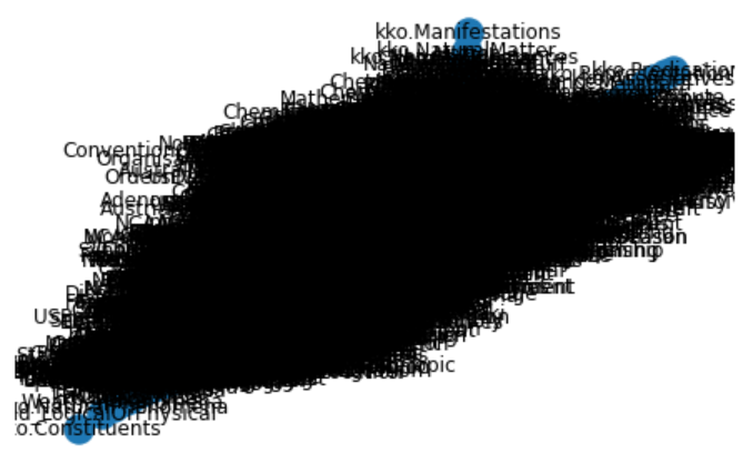
Note in the routine below, which is fairly straightforward in nature, I inserted a print statement to separate out the initial graph construction step from graph rendering. The graph construction takes mere seconds, while rendering the graph took multiple hours.

WARNING!: The cell below takes tens of minutes to hours to run. Please do not execute unless you are able to let this run in the background.
import networkx as nx
import pandas as pd
import matplotlib.pyplot as plt

df = pd.read_csv('C:/1-PythonProjects/kbpedia/v300/extractions/data/graph_specs.csv')
Graphtype = nx.DiGraph()
G = nx.from_pandas_edgelist(df, edge_attr='weight', create_using=Graphtype)
print('Graph construction complete.')
pos = nx.spring_layout(G,scale=1)

nx.draw(G,pos, with_labels=True)
plt.show()
Baseline KBpedia Visualization with Labels
Figure 1: Baseline KBpedia Visualization with Labels
NOTE: The figures in this article are static captures of the interactive electronic notebook. See note at bottom for how to access these.

Since the labels render this uninterpretable, we tried the same approach without labels.

WARNING!: The cell below takes tens of minutes to hours to run. Please do not execute unless you are able to let this run in the background.
plt.figure(figsize=(8,6))
nx.draw(G,pos, with_labels=False)
plt.show() 
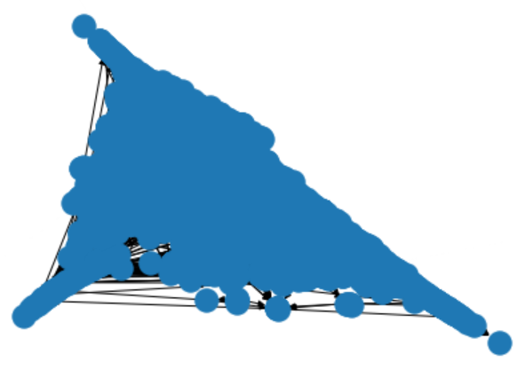
Baseline KBpedia Visualization without Labels
Figure 2: Baseline KBpedia Visualization without Labels

This view is hardly any better.

Given the lengthy times it took to generate these visualizations, I decided to return to our candidate list and try other packages.

More Diligence on NetworkX Alternatives

If you recall, my first preferred option was graph-tool because of its reported speed and its wide variety of graph algorithms and layouts. The problem with graph-tool, as with the other alternatives, is that a C++ compiler is required, along with other dependencies. After extensive research online, I was unable to find an example of a Windows instance that was able to install graph-tool and its dependencies successfully.

I turned next to NetworKit. Though visualization choices are limited in comparison to the other C++ alternatives, this package has clearly been designed for network analysis and has a strong basis in data science. This package does offer a Windows 10 installation path, but one that suggests adding a virtual Linux subsystem layer to Windows. Again, I deemed this to be more complexity than a single visualization component warranted.

With igraph, I went through the steps of attempting an install, but clearly was also missing dependencies and using it kept killing the kernel in Jupyter Notebook. Again, perhaps with more research and time, I could have gotten this package to work, but it seemed to impose too much effort for a Windows environment for the possible reward.

Lastly, given these difficulties, and the fact that SNAP had been under less active development in recent years, I chose not to pursue this option further.

In the end, I think with some work I could have figured out how to get igraph to install, and perhaps NetworKit as well. However, as a demo candidate being chosen for Python newbies, it struck me that no reader of this series would want to spend the time jumping through such complicated hoops in order to get a C++ option running. Perhaps in a production environment these configuration efforts may be warranted. However, for our teaching purposes, I judged trying to get a C++ installation on Windows as not worth the effort. I do believe this leaves an opening for one or more developers of these packages to figure out a better installation process for Windows. But that is a matter for the developers, not for a newbie Python user such as me.

Faster Testing of NetworkX with the Upper KBpedia

So these realizations left me with the NetworkX alternative as the prime option. Given the time it took to render the full KBpedia, I decided to use the smaller upper structure of KBpedia to work out the display and rendering options before applying it to the full KBpedia.

I thus created offline a smaller graph dataset that consisted of the 72 SuperTypes and all of their direct resource concept (RC) children. You can inspect this dataset (df_kko) in a similar matter to the snippet noted above for the full KBpedia (df).

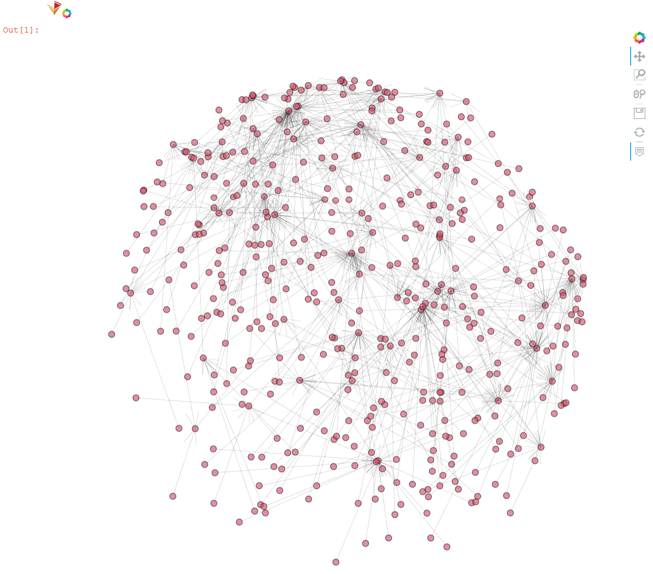
Also, to overcome some of the display limitations of the standard NetworkX renderers, I recalled that the HoloViews package used in the last installment also had an optional component, hvPlot, designed specifically to work with NetworkX graph layouts and datasets. The advantage of this approach is that we would gain interactivity and some of the tooltips when hovering over nodes on the graph.

I literally spent days trying to get all of these components to work together in terms of my desired visualizations where SuperType nodes (and their RCs) would be colored differently and the size of the nodes would be dependent on the number of subclasses. Alas, I was unable to get these desired options to work. In part, I think this is because of the immaturity of the complete ecosystem. In part, it is also due to my lack of Python skills and the fact that the entire chain of NetworkX → bokeh → HoloViews → hvPlot each provides its own syntax and optional functions for making visualization tweaks. It is hard to know what governs what and how to get all of the parts to work together nicely.

Fortunately, with the smaller input graph set, it is nearly instantaneous to make and see changes in real time. Despite the number of tests applied, the resulting code is fairly small and straightforward:

import pandas as pd
import holoviews as hv
import networkx as nx
import hvplot.networkx as hvnx
from holoviews import opts
from bokeh.models import HoverTool

hv.extension('bokeh')

# Load the data
# on MyBinder: https://github.com/Cognonto/CWPK/blob/master/sandbox/extracts/data/kko_graph_specs.csv
df_kko = pd.read_csv('C:/1-PythonProjects/kbpedia/v300/extractions/data/kko_graph_specs.csv')

# Define the graph
G_kko = nx.from_pandas_edgelist(df_kko, 'source', 'target', ['Subs', 'SuperType', 'Color'], create_using=nx.DiGraph())

pos = nx.spring_layout(G_kko, k=0.4, iterations=70)

hvnx.draw(G_kko, pos, node_color='#D6556D', alpha=0.65).opts(node_size=10, width=950, height=950, 
                           edge_line_width=0.2, tools=['hover'], inspection_policy='edges')
Smaller Scale KKO (KBpedia) Graph
Figure 3: Smaller Scale KKO (KBpedia) Graph

Final Large-scale Visualization with NetworkX

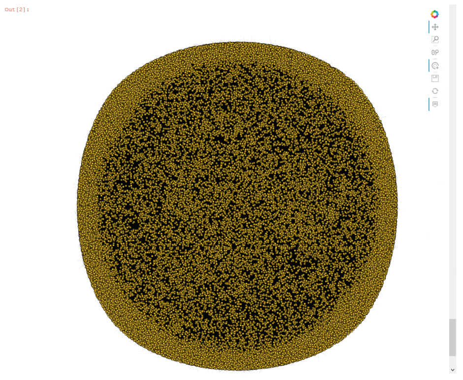
With these tests of the smaller graph complete, we are now ready to produce the final visualization of the full KBpedia graph. Though the modified code is presented below, and does run, we actually use a captured figure below the code listing to keep this page size manageable.

WARNING!: The cell below takes more than three hours to run on our standard laptop and creates a page file of 36 MB. Please do not execute unless you are able to let this run in the background.
import pandas as pd
import holoviews as hv
import networkx as nx
from holoviews import opts
import hvplot.networkx as hvnx
#from bokeh.models import HoverTool

hv.extension('bokeh')

df = pd.read_csv('C:/1-PythonProjects/kbpedia/v300/extractions/data/graph_specs.csv')
Graphtype = nx.DiGraph()
G = nx.from_pandas_edgelist(df, edge_attr='weight', create_using=Graphtype)
print('Graph construction complete.')

pos = nx.spring_layout(G, k=0.4, iterations=70)

hvnx.draw(G, pos, node_color='#FCCC25', alpha=0.65).opts(node_size=5, width=950, height=950, 
                           edge_line_width=0.1)

#, tools=['hover'], inspection_policy='edges'
Full-sized KBpedia Graph
Figure 4: Full-sized KBpedia Graph

Other Graphing Options

I admit I am disappointed and frustrated with available Python options to capture the full scale of KBpedia. The pure Python options are unacceptably slow. Options that promise better performance and a wider choice of layouts and visualizations are difficult, if not impossible, to install on Windows. Of all of the options directly tested, none allowed me (at least with my limited Python skill level) to vary node colors or node sizes by in-degrees.

On the other hand, we began to learn some of the robust NetworkX package and will have occasion to investigate it further in relation to network analysis (CWPK #61). Further, as a venerable package, NetworkX offers a wide spectrum of graph data formats that it can read and write. We can export our graph specifications to a number of forms that perhaps will provide better visualization choices. As examples, here are ways to specify two of NetworkX’s formats, both of which may be used as inputs to the Gephi package. (For more about Gephi and Cytoscape as options here, see the initial links at the beginning of this installment.)

import pandas as pd
import networkx as nx

df = pd.read_csv('C:/1-PythonProjects/kbpedia/v300/extractions/data/graph_specs.csv')
Graphtype = nx.DiGraph()
G = nx.from_pandas_edgelist(df, edge_attr='weight', create_using=Graphtype)

nx.write_gexf(G, 'C:/1-PythonProjects/kbpedia/v300/extractions/data/graph_specs.gexf')

print('Gephi file complete.')

nx.write_gml(G, 'C:/1-PythonProjects/kbpedia/v300/extractions/data/graph_specs.gml')

print('GML file complete.')

Additional Documentation

This section presents the significant amount of material reviewed in order to make the choices for use in this present CWPK installment.

First, it is possible to get online help for most options to be tested. For example:

hv.help(hvnx.draw)

And, here are some links related to options investigated for this installment, some tested, some not:

NetworkX

These same references above are also provided for the ‘latest’ version.

graph-tool

NetworKit

deepgraph

nxviz

Netwulf

igraph

SNAP

pygraphistry

ipycytoscape

NOTE: This article is part of the Cooking with Python and KBpedia series. See the CWPK listing for other articles in the series. KBpedia has its own Web site. The cowpoke Python code listing covering the series is also available from GitHub.
NOTE: This CWPK installment is available both as an online interactive file or as a direct download to use locally. Make sure and pick the correct installment number. For the online interactive option, pick the *.ipynb file. It may take a bit of time for the interactive option to load.
I am at best an amateur with Python. There are likely more efficient methods for coding these steps than what I provide. I encourage you to experiment — which is part of the fun of Python — and to notify me should you make improvements.

Posted by AI3's author, Mike Bergman Posted on October 21, 2020 at 11:04 am in CWPK, KBpedia, Semantic Web Tools | Comments (0)
The URI link reference to this post is: https://www.mkbergman.com/2404/cwpk-56-graph-visualization-and-extraction/
The URI to trackback this post is: https://www.mkbergman.com/2404/cwpk-56-graph-visualization-and-extraction/trackback/
Posted:October 19, 2020

It’s Time for Some Pretty Figures and Charts

It is time in our Cooking with Python and KBpedia series to investigate some charting options for presenting data or output. One of the remarkable things about Python is the wealth of add-on packages that one may employ, and visualization is no exception.

What we will first do in this installment is to investigate some of the leading charting options in Python sufficient for us to make an initial selection. We want nice looking output that is easily configured and fed with selected data. We also want multiple visualization types perhaps to work from the same framework, so that we need not make single choices, but multiple ones for multiple circumstances as our visualization needs unfold.

We will next tailor up some datasets for charting. We’d like to see a distribution histogram of our typlogies. We’d like to see the distribution of major components in the system, notably classes, properties, and mappings. We’d like to see a distribution of our notable links (mappings) to external sources. And, we’d like to see the interactive effect of our disjointedness assignments between typologies. The first desires can be met with bar and pie charts. the last with some kind of interaction matrix. (We investigate the actual knowledge graph in the next CWPK installment.)

We also want to learn how to take the data as it comes to us to process into a form suitable for visualization. Naturally, since we are generating many of these datasets ourselves, we could alter the initial generating routines in order to more closely match the needs for visualization inputs. However, for now, we will take our existing outputs as is, since that is also a good use case for wrangling wild data.

Review of Visualization Options

For quite a period, my investigation of Python visualization options had been focused on individual packages. I liked the charting output of options like Seaborn and Bokeh, and knew that Matplotlib and Plotly had close ties with Jupyter Notebook. I had previously worked with JavaScript visualization toolkits, and liked their responsiveness and often interactivity. On independent grounds, I was quite impressed with the D3.js library, though I was still investigating the suitability of that to Python. Because CWPK is a series that focuses on Python, though, I had some initial prejudice to avoid JS-dominated options. I also had spent quite a bit of time looking at graph visualization (see next installment), and had some concerns that I was not yet finding a package that met my desired checklist.

As I researched further, it was clear there were going to be trade-offs when picking a single, say, charting and then graphing package. It was about this time I came across the PyViz ecosystem. (Overall helpful tools listing: https://pyviz.org/tools.html.) PyViz is nominally the visualization complement to the broader PyData community.

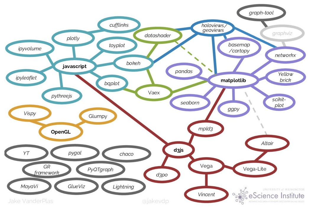
Jake VanderPlas pulled together a nice overview of the Python visualization landscape and how it evolved for a presentation to PyCon in 2017. Here is the summary diagram from his talk:

Python Visualization Landscape
Figure 1: Python Visualization Landscape

Source: Jake VanderPlas, “Python’s Visualization Landscape,” PyCon 2017, https://speakerdeck.com/jakevdp/pythons-visualization-landscape-pycon-2017

The trend in visualization for quite a few years has been the development of wrappers over more primitive drawing programs that abstract and make the definition of graphs and charts much easier. As these higher-level libraries have evolved they have also come to embrace multiple lower-level packages under their umbrellas. The trade-off in easier definitions of visualization objects is some lack of direct control over the output.

Because of the central role of Jupyter Notebooks in this CWPK series, and not having a more informed basis for making an alternative choice, I chose to begin our visualization efforts with Holoviews, which is an umbrella packaging over the applications as shown in the figure above. Bokeh provides a nice suite of interactive plotting and figure types. NetworkX (which is used in the next installment) has good network analysis tools and links to network graph drawing routines. And Matplotlib is another central hub for various plot types, many other Python visualization projects, color palettes, and NumPy.

Getting Started

Like most Python packages, installation of Holoviews is quite straightforward. Since I also know we will be using the bokeh plot library, we include it as well when installing the system:

   conda install -c pyviz holoviews bokeh

Generating the First Chart

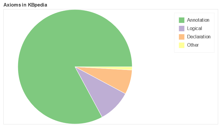
The first chart we want to tackle is the distribution of major components in KBpedia, which we will visualize with a pie chart. Statistics from our prior efforts (see the prior CWPK #54) and what is generated in the Protégé interface provide our basic counts. Since the input data set is so small, we will simply enter it directly into the code. (Later examples will show how we load CSV data using pandas .)

For the pie chart we will be using, we pick the bokeh plotting package. In reviewing code samples across the Web, we pick one example and modify it for our needs. I will explain key aspects of this routine after the code listing and chart output:

import panel as pn
pn.extension()
from math import pi
import pandas as pd                                                                   # Note 1

from bokeh.palettes import Accent
from bokeh.plotting import figure
from bokeh.transform import cumsum

a = {                                                                                 # Note 2
    'Annotation': 759398,
    'Logical': 85333,
    'Declaration': 63229,
    'Other': 8274
}

data = pd.Series(a).reset_index(name='value').rename(columns={'index':'axiom'})
data['angle'] = data['value']/data['value'].sum() * 2*pi
data['color'] = Accent[len(a)]

p = figure(plot_height=350, title='Axioms in KBpedia', toolbar_location=None,         # Note 3
           tools='hover', tooltips='@axiom: @value', x_range=(-0.5, 1.0))

r = p.wedge(x=0, y=1, radius=0.4,
        start_angle=cumsum('angle', include_zero=True), end_angle=cumsum('angle'),    # Note 4
        line_color='white', fill_color='color', legend_field='axiom', source=data)

p.axis.axis_label=None                                                                # Note 5
p.axis.visible=False
p.grid.grid_line_color = None

bokeh_pane = pn.pane.Bokeh(p)
bokeh_pane                                                                            # Note 6
Pie Chart of KBpedia Axioms
NOTE: The figures in this article are static captures of the interactive electronic notebook. See note at bottom for how to access these.

As with our other special routines, we begin by importing the new packages that are required for the pie chart (1). One of the imports, pandas, gives us very nice ways to relate an input CSV file or entered data to pick up item labels (rows) and attributes (col). Another notable import is to pick the color palette we want to use for our figure.

As noted, because our dataset is so small, we just enter it directly into the routine (2). Note how data entry conforms to the Python dictionary format of key:value pairs. Our data section also provides how we will convert the actual numbers of our data into segment slices in the pie chart, as well as defines for us the labels to be used based on pandas’ capabilities. We also indicate how many discrete colors we wish to use from the Accents palette. (Palettes may be chosen based on a set of discrete colors over a given spectrum, or, for larger data sets, picked as an increment over a continuous color spectrum. See further Additional Documentation below.)

The next two parts dictate how we format the chart itself. The first part sets the inputs for the overall figure, such as size, aspect, title, background color and so forth ((3)). We can also invoke some tools at this point, including the useful ‘hover’ that enables us to see actual values or related when mousing over items in the final figure. The second part of this specification guides the actual chart type display, ‘wedge’ in this case because of our choice of a pie chart (4). To see the various attributes available to us, we can invoke the standard dir() Python function:

dir(p)

We continue to add the final specifications to our figure (5) and then invoke our function to render the chart (6).

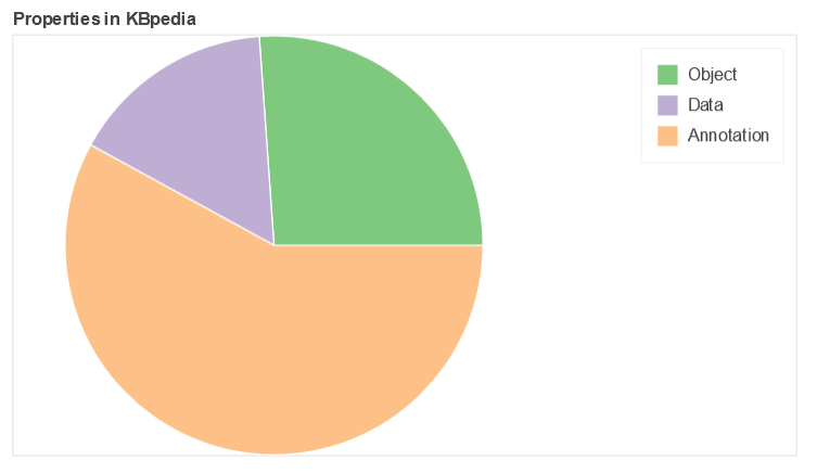
We can take this same pattern and apply new data on the distribution of properties within KBpedia according to our three major types, which produces this second pie chart, again following the earlier approach:

prop = {
    'Object': 1316,
    'Data': 802,
    'Annotation': 2919
}

data = pd.Series(prop).reset_index(name='value').rename(columns={'index':'property'})
data['angle'] = data['value']/data['value'].sum() * 2*pi
data['color'] = Accent[len(prop)]

p = figure(plot_height=350, title="Properties in KBpedia", toolbar_location=None,
           tools="hover", tooltips="@property: @value", x_range=(-0.5, 1.0))

r = p.wedge(x=0, y=1, radius=0.4,
        start_angle=cumsum('angle', include_zero=True), end_angle=cumsum('angle'),
        line_color="white", fill_color='color', legend_field='property', source=data)

p.axis.axis_label=None
p.axis.visible=False
p.grid.grid_line_color = None

bokeh_pane = pn.pane.Bokeh(p)
bokeh_pane
Pie Chart of KBpedia Properties

More Complicated Datasets

The two remaining figures in this charting installment use a considerably more complicated dataset: an interaction matrix of the SuperTypes (STs) in KBpedia. There are more than 70 STs under the Generals branch in KBpedia, but a few of them are very-high level (Manifestations, Symbolic, Systems, ConceptualSystems, Concepts, Methodeutic, KnowledgeDomains), leaving a total of about 64 that have potentially meaningful interactions. If we assume that interactions are transitive, that gives us a total of 2016 possible pairwise combinations among these STs ((N * N-1)/2).

From a substantive standpoint, some interactions are nearly global such as for Predications (including AttributeTypes, DirectRelations, and RepresentationTypes, specifically incorporating AdjunctualAttributes, ContextualAttributes, IntrinsicAttributes, CopulativeRelations, MediativeRelations, Associatives, Denotatives, and Indexes), and about 70 pair interactions are with direct parents. When we further remove these potential interactions, we are left with about 50 remaining STs, representing a final set of 1204 ST pairwise interactions.

Of this final set, 50% (596) are completely disjoint, 646 are disjoint to max 0.5%, and only 355 (30%) have overlaps exceeding 10%.

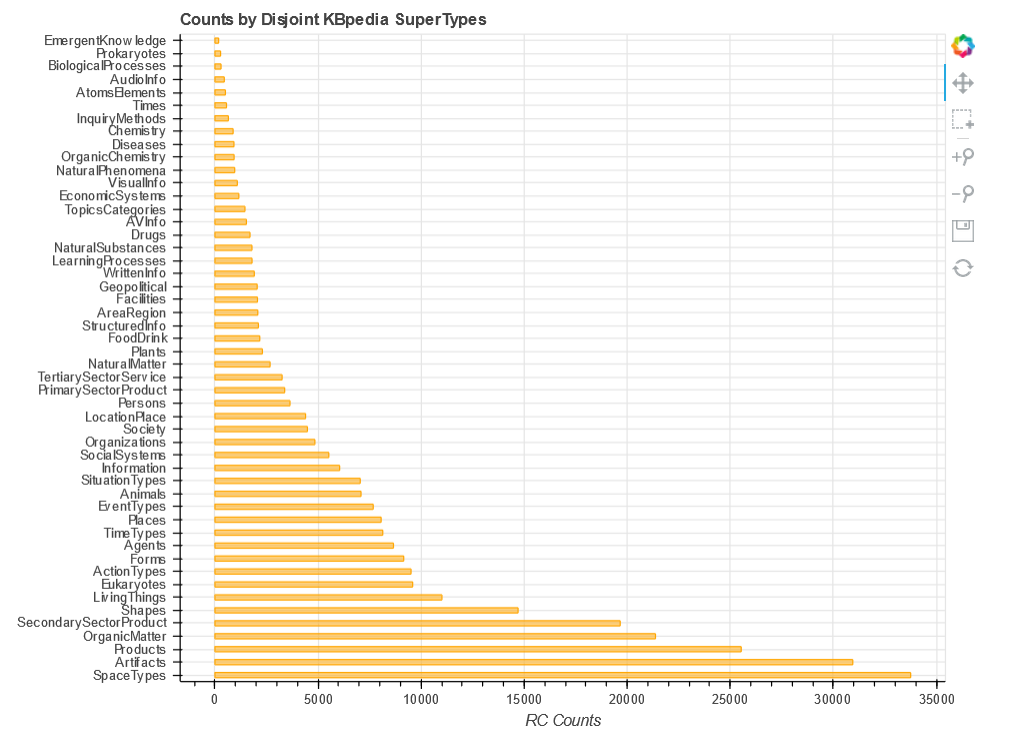
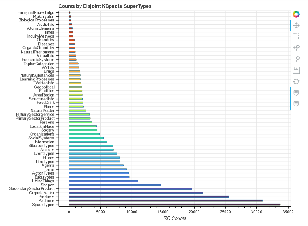
There are two charts we want to produce from this larger dataset. The first is a histogram of the distribution of STs as measured by number of reference concepts (RCs) each contains, and the second is a heatmap of the ST interactions that meaningfully participate in disjoint assertions.

In getting the basic input data into shape, it would have been possible to rely on many standard Python packages geared to data wrangling, but the fact is that a dataset of even this size can perhaps be more effectively and quickly manipulated in a spreadsheet, which is how I approached these sets. The trick to large-scale sorts and manipulations of such data in a spreadsheet is to create temporary columns or rows in which unique sequence numbers are designed (with the numbers being calculated from a formula such a new cell ID = prior cell ID + 1), copy the formulas as values, and then include these temporary rows or columns in the global (named) block that contains all of the data. One can then do many manipulations of the data matrix and still return to desired organization and order by sorting again on these temporary sequence numbers.

Histogram Distribution of STs by RCs

Let’s first begin, then, with the routine for displaying our SuperTypes (STs) according to their count of reference concepts (RCs). We import our needed Python packages, including a variety of color palettes, and reference our source input file in CSV format. Note we are reading this input file into pandas, which we invoke in order to see the input data (ST by RC count):

import pandas as pd
from bokeh.plotting import figure, output_notebook, show, ColumnDataSource
from bokeh.models.tools import HoverTool
from bokeh.transform import factor_cmap
from bokeh.palettes import viridis, magma, Turbo256, linear_palette

output_notebook()

src = r'C:\1-PythonProjects\kbpedia\v300\extractions\data\supertypes_counts.csv'
# on MyBinder, find at: CWPK/sandbox/extracts/data/

df = pd.read_csv(src)

df

Again using pandas, we are able to relate our column data to what will be displayed in the final figure:

supertypes = df['SuperTypes']
rcs = df['RCs']

supertypes

As with our previous figures, we have to input our settings for both the overall figure and the plot type (horizontal bar, in this case):

p = figure(y_range=supertypes,
           title = 'Counts by Disjoint KBpedia SuperTypes',
           x_axis_label = 'RC Counts',
           plot_width = 800,
           plot_height = 600,
           tools = 'pan,box_select,zoom_in,zoom_out,save,reset'
           )

p.hbar(y = supertypes,
       right = rcs,
       left = 0,
       height = 0.4,
       color = 'orange',
       fill_alpha = 0.5
       )

show(p)
Bar Chart of KBpedia RCs by SuperType (single color)

This shows the ease of working directly with pandas dataframes. But, there is a built-in function called ColumnDataSource that gives us some additional flexibility:

source = ColumnDataSource(df)

st_list = source.data['SuperTypes'].tolist()

p2 = figure(y_range = st_list,                              # Note the change of source here
            title = 'Counts by Disjoint KBpedia SuperTypes',
            x_axis_label = 'RC Counts',
            plot_width = 800,
            plot_height = 600,
            tools = 'pan,box_select,zoom_in,zoom_out,save,reset'
           )

p2.hbar(y = 'SuperTypes',                                   
        right = 'RCs',                                      
        left = 0,
        height = 0.4,
        color = 'orange',
        fill_alpha = 0.5,
        source=source                                      # Note the additional source
       )

hover = HoverTool()

hover.tooltips = """
    <div>
        <div><strong>SuperType: </strong>@SuperTypes</div>
        <div><strong>RCs: </strong>@RCs</div>         
    </div>
"""
p2.add_tools(hover)

show(p2)

Next, we want to add a palette. After trying the variations first loaded, we choose Turbo256 and tell the system the number of discrete colors desired:

mypalette = linear_palette(Turbo256,50)

p2.hbar(y = 'SuperTypes',
        right = 'RCs',
        left = 0,
        height = 0.4,
        fill_color = factor_cmap(
               'SuperTypes',
               palette = mypalette,
               factors=st_list
               ),
        fill_alpha=0.9,
        source=source
)

hover = HoverTool()

hover.tooltips = """
    <div>
        <div><strong>SuperType: </strong>@SuperTypes</div>
        <div><strong>RCs: </strong>@RCs</div>         
    </div>
"""
p2.add_tools(hover)

show(p2)
Bar Chart of KBpedia RCs by SuperType (multi-color)

This now achieves the look we desire, with the bars sorted in order and a nice spectrum of colors across the bars. We also have hover tips that provide the actual data for each bar. The latter is made possible by the ColumnDataSource where we replace the standard ‘dict’ format into x, y.

Since we continue to gain a bit more tailoring and experience with each chart, we decide it is time to tackle the heatmap.

Heatmap Display

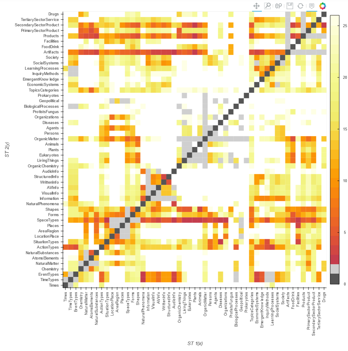
A heatmap is an interaction matrix. In our case, what we want to display are the SuperTypes that have some degree of disjointedness plotted against one another, with the number of RCs in x displayed against the RCs within y. Since, as the previous horizontal bar chart shows, we have a wide range of RC counts by SuperType, to normalize these interactions we decide to express the overlap as a percentage.

We again set up our imports and figure as before. If you want to see the actual data input file and format, invoke df_h as we did before:

import holoviews as hv
from holoviews import opts
hv.extension('bokeh', 'matplotlib')
import pandas as pd
import matplotlib

src = r'C:\1-PythonProjects\kbpedia\v300\extractions\data\st_heatmap.csv'
# on MyBinder, find at: CWPK/sandbox/extracts/data/

df_h = pd.read_csv(src)

heatmap = hv.HeatMap(df_h, kdims=['ST 1(x)', 'ST 2(y)'], vdims=['Rank', 'Overlap', 'Overlap/ST 1', 
                    'ST 1 RCs', 'ST 2 RCs'])

color_list = ['#555555', '#CFCFCF', '#C53D4D', '#D14643', '#DC5039', '#E55B30',
           '#EB6527', '#F0701E', '#F47A16', '#F8870D', '#FA9306', '#FB9E07',
           '#FBAC10', '#FBB91E', '#F9C52C', '#F6D33F', '#F3E056', '#F1EB6C',
           '#F1EE74', '#F2F381', '#F3F689', '#F5F891', '#F6F99F', '#F7FAAC',
           '#F9FBB9', '#FAFCC6', '#FCFDD3', '#FEFFE5']

# for color_list, see https://stackoverflow.com/questions/21094288/convert-list-of-rgb-codes-to-matplotlib-colormap

my_cmap = matplotlib.colors.ListedColormap(color_list, name='interact')

heatmap.opts(opts.HeatMap(tools=['hover'], cmap=my_cmap, colorbar=True, width=960, 
                          xrotation=90, height=960, toolbar='above', clim=(0, 26)))

heatmap
Overlap Heatmap of Shared RCs Between SuperTypes

All of the available palettes did not have a color spectrum we liked, plus we needed to introduce the dark gray color (where an ST is being mapped to itself and therefore needs to be excluded). Another exclusion (light gray) is to remove ST interactions with anything in its parental lineage.

As for useful interactions, we wanted a close to smooth distribution of overlap intensities across the entire spectrum of 0% overlap (no color, white) to more than 95% (dark red). We achieve this distribution by not working directly from the percentage overlap figures, but by the mapping of thse percentage overlaps to a more-or-less smooth ranking assignment from roughly 0 to 30. It is the rank value that determines the color of the interaction cell.

There are clearly many specifics that may set and tweaked for your own figures. The call below is one example of how to get explanation of these settings.

hv.help(hv.HeatMap)

Additional Documentation

Colors and Palettes

Charting

What to chart?

Heatmaps

Other

NOTE: This article is part of the Cooking with Python and KBpedia series. See the CWPK listing for other articles in the series. KBpedia has its own Web site. The cowpoke Python code listing covering the series is also available from GitHub.
NOTE: This CWPK installment is available both as an online interactive file or as a direct download to use locally. Make sure and pick the correct installment number. For the online interactive option, pick the *.ipynb file. It may take a bit of time for the interactive option to load.
I am at best an amateur with Python. There are likely more efficient methods for coding these steps than what I provide. I encourage you to experiment — which is part of the fun of Python — and to notify me should you make improvements.

Posted by AI3's author, Mike Bergman Posted on October 19, 2020 at 11:44 am in CWPK, KBpedia, Semantic Web Tools | Comments (0)
The URI link reference to this post is: https://www.mkbergman.com/2402/cwpk-55-charting/
The URI to trackback this post is: https://www.mkbergman.com/2402/cwpk-55-charting/trackback/
Posted:October 15, 2020

This installment in our Cooking with Python and KBpedia series covers two useful (essential?) utilities for any substantial project: stats and logging. stats refers to internal program or knowledge graph metrics, not a generalized statistical analysis package. logging is a longstanding Python module that provides persistence and superior control over using simple print statements for program tracing and debugging.

On the stats side, we will emphasize capturing metrics not already available when using Protégé, which provides its own set of useful baseline statistics. (See Figure 1.) These metrics are mostly simple counts, with some sums and averages. The results of these metrics are some of the numerical data points that we will use in the next installment on charting.

On the logging front, we will edit all of our existing routines to log to file, as well as print to screen. We can embed these routines in existing functions so that we may better track our efforts.

An Internal Stats Module

In our earlier extract-and-build routines we have already put in place the basic file and set processing steps necessary to capture additional metrics. We will add to these here, in the process creating an internal stats module in our cowpoke package.

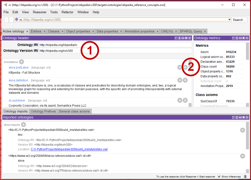
First, there is no need to duplicate the information that already comes to us when using Protégé. Here are the standard stats provided on the main start-up screen:

Protégé Internal Stats
Figure 1: Protégé Internal Stats

We are loading up here (1) our KBpedia v 300 in-progress. We can see that Protégé gives us counts (2) of classes (58200), object properties (1316), data properties (802), annotation properties (2919), and a few other metrics.

We will take these values as givens, and will enter them as part of the initialization for our own internal procedures (for checking totals and calculating percentages).

Pyflakes is a simple Python code checker that you may want to consider. If you want to add in stylistic checks, you want flake8, which combines Pyflakes with style checks against PEP 8 or pycodestyle. Pylint is another static code style checker.

from cowpoke.__main__ import *
from cowpoke.config import *
### KEY CONFIG SETTINGS (see build_deck in config.py) ###                
# 'kb_src'        : 'standard'
# count           : 14                                                    # Note 1
# out_file        : 'C:/1-PythonProjects/kbpedia/v300/targets/stats/kko_typol_stats.csv'

from itertools import combinations                                       # Note 2

def typol_stats(**build_deck):
    kko_list = typol_dict.values()
    count = build_deck.get('count')
    out_file = build_deck.get('out_file')
    with open(out_file, 'w', encoding='utf8') as output:
        print('count,size_1,kko_1,size_2,kko_2,intersect RCs', file=output)
        for i in combinations(kko_list,2):                              
            kko_1 = i[0]                                              
            kko_2 = i[1]                                              
            kko_1_frag = kko_1.replace('kko.', '')
            kko_1 = getattr(kko, kko_1_frag)
            print(kko_1_frag)
            kko_2_frag = kko_2.replace('kko.', '')
            kko_2 = getattr(kko, kko_2_frag)     
            descent_1 = kko_1.descendants(include_self = False)       
            descent_1 = set(descent_1)
            size_1 = len(descent_1)
            descent_2 = kko_2.descendants(include_self = False)
            descent_2 = set(descent_2)
            size_2 = len(descent_2)
            intersect = descent_1.intersection(descent_2)              
            num = len(intersect)
            if num <= count:                                           
                print(num, size_1, kko_1, size_2, kko_2, intersect, sep=',', file=output)
            else: 
                print(num, size_1, kko_1, size_2, kko_2, sep=',', file=output)
    print('KKO typology intersection analysis is done.')
typol_stats(**build_deck)

The procedure above takes a few minutes to run. You can inspect what the routine produces at C:/1-PythonProjects/kbpedia/v300/targets/stats/kko_typol_stats.csv.

We can also get summary statistics from the knowledge graph using the rdflib package. Here is a modification of one of the library’s routine to obtain some VoID statistics:

import collections

from rdflib import URIRef, Graph, Literal
from rdflib.namespace import VOID, RDF

graph = world.as_rdflib_graph()
g = graph

def generate2VoID(g, dataset=None, res=None, distinctForPartitions=True):
    """
    Returns a VoID description of the passed dataset

    For more info on Vocabulary of Interlinked Datasets (VoID), see:
    http://vocab.deri.ie/void

    This only makes two passes through the triples (once to detect the types
    of things)

    The tradeoff is that lots of temporary structures are built up in memory
    meaning lots of memory may be consumed :)
    
    distinctSubjects/objects are tracked for each class/propertyPartition
    this requires more memory again

    """

    typeMap = collections.defaultdict(set)
    classes = collections.defaultdict(set)
    for e, c in g.subject_objects(RDF.type):
        classes[c].add(e)
        typeMap[e].add(c)

    triples = 0
    subjects = set()
    objects = set()
    properties = set()
    classCount = collections.defaultdict(int)
    propCount = collections.defaultdict(int)

    classProps = collections.defaultdict(set)
    classObjects = collections.defaultdict(set)
    propSubjects = collections.defaultdict(set)
    propObjects = collections.defaultdict(set)
    num_classObjects = 0
    num_propSubjects = 0
    num_propObjects = 0
    
    for s, p, o in g:

        triples += 1
        subjects.add(s)
        properties.add(p)
        objects.add(o)

        # class partitions
        if s in typeMap:
            for c in typeMap[s]:
                classCount[c] += 1
                if distinctForPartitions:
                    classObjects[c].add(o)
                    classProps[c].add(p)

        # property partitions
        propCount[p] += 1
        if distinctForPartitions:
            propObjects[p].add(o)
            propSubjects[p].add(s)

    if not dataset:
        dataset = URIRef('http://kbpedia.org/kko/rc/')

    if not res:
        res = Graph()

    res.add((dataset, RDF.type, VOID.Dataset))

    # basic stats
    res.add((dataset, VOID.triples, Literal(triples)))
    res.add((dataset, VOID.classes, Literal(len(classes))))

    res.add((dataset, VOID.distinctObjects, Literal(len(objects))))
    res.add((dataset, VOID.distinctSubjects, Literal(len(subjects))))
    res.add((dataset, VOID.properties, Literal(len(properties))))

    for i, c in enumerate(classes):
        part = URIRef(dataset + "_class%d" % i)
        res.add((dataset, VOID.classPartition, part))
        res.add((part, RDF.type, VOID.Dataset))

        res.add((part, VOID.triples, Literal(classCount[c])))
        res.add((part, VOID.classes, Literal(1)))

        res.add((part, VOID["class"], c))

        res.add((part, VOID.entities, Literal(len(classes[c]))))
        res.add((part, VOID.distinctSubjects, Literal(len(classes[c]))))

        if distinctForPartitions:
            res.add(
                (part, VOID.properties, Literal(len(classProps[c]))))
            res.add((part, VOID.distinctObjects,
                     Literal(len(classObjects[c]))))
            num_classObjects = num_classObjects + len(classObjects[c])           
            

    for i, p in enumerate(properties):
        part = URIRef(dataset + "_property%d" % i)
        res.add((dataset, VOID.propertyPartition, part))
        res.add((part, RDF.type, VOID.Dataset))

        res.add((part, VOID.triples, Literal(propCount[p])))
        res.add((part, VOID.properties, Literal(1)))

        res.add((part, VOID.property, p))

        if distinctForPartitions:

            entities = 0
            propClasses = set()
            for s in propSubjects[p]:
                if s in typeMap:
                    entities += 1
                for c in typeMap[s]:
                    propClasses.add(c)

            res.add((part, VOID.entities, Literal(entities)))
            res.add((part, VOID.classes, Literal(len(propClasses))))

            res.add((part, VOID.distinctSubjects,
                     Literal(len(propSubjects[p]))))
            res.add((part, VOID.distinctObjects,
                     Literal(len(propObjects[p]))))
            num_propSubjects = num_propSubjects + len(propSubjects[p])
            num_propObjects = num_propObjects + len(propObjects[p]) 
    print('triples:', triples)
    print('subjects:', len(subjects))
    print('objects:', len(objects))
    print('classObjects:', num_classObjects)
    print('propObjects:', num_propObjects)      
    print('propSubjects:', num_propSubjects)
     

    return res, dataset
generate2VoID(g, dataset=None, res=None, distinctForPartitions=True)
triples: 1662129
subjects: 213395
objects: 698372
classObjects: 850446
propObjects: 858445
propSubjects: 1268005
(<Graph identifier=Na47c69e2f7b84d9b911c46e2cdf0fe11 (<class 'rdflib.graph.Graph'>)>,
rdflib.term.URIRef('http://kbpedia.org/kko/rc/'))

These metrics can go into the pot with the summary statistics we also gain from Protégé. We’ll see some graphic reports on these numbers in the next installment.

Logging

I think an honest appraisal may straddle the fence about whether logging makes sense for the cowpoke package. On the one hand, we have begun to assemble a fair degree of code within the package, that perhaps would normally trigger the advisability of logging. On the other hand, we run the various scripts only sporadically, and in pieces when we do. There is not a continuous production function under what we have done, so far.

If we were to introduce this code into a production setting or get multiple developers involved, I would definitely argue for the need for logging. Consider what we have in the current cowpoke code base as the transition condition for looking at this question. However, since logging is good practice, and we are close, let’s go ahead and invoke the capability nonetheless.

One chooses logging over the initial print statements because we gain these benefits:

  1. The ability to time stamp our logging messages
  2. The ability to keep our logging messages persistent
  3. We can generate messages constantly in the background for later inspection, and
  4. We can better organize our logging messages.

The logging module that comes with Python is quite mature and has further advantages:

  1. We can control the warning level of the messages and what warning levels trigger logging
  2. We can format the messages as we wish, and
  3. We can send our messages to file, screen, or socket.

By default, the Python logging module has five pre-set warning levels:

  • debug – detailed information, typically of interest only when diagnosing problems
  • info – confirmation that things are working as expected
  • warning – an indication that something unexpected happened, or indicative of some problem in the near future (e.g. ‘disk space low’). The software is still working as expected
  • error – due to a more serious problem, the software has not been able to perform some function, or
  • critical – a serious error, indicating that the program itself may be unable to continue running.

We’ll see in the following steps how we can configure the logger and set it up for working with our existing functions.

Configuration

Logging is organized as a tree, with the root being the system level. For a single package, it is best to set up a separate main logging branch under the root so that warnings and loggings can be treated consistently throughout the package. This design, for example, allows warning messages and logging levels to be set with a single call across the entire package (sub-branches may have their own conditions). This is what is called adding a ‘custom’ logger to your system.

Configurations may be set in Python code (the method we will use, because it is the simplest) or via a separate .ini file. Configuration settings include most of the specified items below.

Handlers

You can set up logging messages to go to console (screen) or file. In our examples below, we will do both.

Formatters

You can set up how your messages are formatted. We can also format console v file messages differently, as our examples below show.

Default Messages

Whenever we insert a logging message, beside setting severity level, we may also assign a message unique to that part of the code. However, if we choose not to assign a new, specific message, the message invoked will be the default one defined in our configuration.

Example Code

Since our set up is straightforward, we will put our configuration settings into our existing config.py file and write our logging messages to the log subdirectory. Here is how our set up looks (with some in-line commentary):

import logging

# Create a custom logger
logger = logging.getLogger(__name__)                # Will invoke name of current module

# Create handlers
log_file = 'C:/1-PythonProjects/kbpedia/v300/targets/logs/kbpedia_logging.log'
#logging.basicConfig(filename=log_file,level=logging.DEBUG)
c_handler = logging.StreamHandler()                 # Separate c_ and f_ handlers
f_handler = logging.FileHandler(log_file)
c_handler.setLevel(logging.WARNING)
f_handler.setLevel(logging.DEBUG)

# Create formatters and add it to handlers          # File logs include time stamp, console does not
c_format = logging.Formatter('%(name)s - %(levelname)s - %(message)s')
f_format = logging.Formatter('%(asctime)s - %(name)s - %(levelname)s - %(message)s')
c_handler.setFormatter(c_format)
f_handler.setFormatter(f_format)

# Add handlers to the logger
logger.addHandler(c_handler)
logger.addHandler(f_handler)

logging.debug('This is a debug message.')
logging.info('This is an informational message.')
logging.warning('Warning! Something does not look right.')
logging.error('You have encountered an error.')
logging.critical('You have experienced a critical problem.')
WARNING:root:Warning! Something does not look right.
ERROR:root:You have encountered an error.
CRITICAL:root:You have experienced a critical problem.

Make sure you have this statement at the top of all of your cowpoke files:

  import logging

Then, as you write or update your routines, use the logging.severity() statement where you previously were using print. This will cause you to get messages to both console and file, at the severity threshold level set. It is that easy!

Additional Documentation

Here is some supporting documentation for today’s installment:

NOTE: This article is part of the Cooking with Python and KBpedia series. See the CWPK listing for other articles in the series. KBpedia has its own Web site. The cowpoke Python code listing covering the series is also available from GitHub.
NOTE: This CWPK installment is available both as an online interactive file or as a direct download to use locally. Make sure and pick the correct installment number. For the online interactive option, pick the *.ipynb file. It may take a bit of time for the interactive option to load.
I am at best an amateur with Python. There are likely more efficient methods for coding these steps than what I provide. I encourage you to experiment — which is part of the fun of Python — and to notify me should you make improvements.

Posted by AI3's author, Mike Bergman Posted on October 15, 2020 at 10:52 am in CWPK, KBpedia, Semantic Web Tools | Comments (0)
The URI link reference to this post is: https://www.mkbergman.com/2401/cwpk-54-statistics-and-logging/
The URI to trackback this post is: https://www.mkbergman.com/2401/cwpk-54-statistics-and-logging/trackback/
Posted:October 14, 2020

Shifting Our Focus to How to Use the Knowledge Graph

Today’s installment marks a kind of a turning point in our Cooking with Python and KBpedia series. Now that our procedures for building, extracting, and managing the knowledge graph itself are in place, we can shift gears to explore how we may use this knowledge artifact. In today’s installment, I introduce a number of category of tools for doing so, and point to their more formal treatment in ensuing installments.

Some of our tools treat the knowledge graph as an object unto itself, providing statistics, logging, and traversals. Some tools allow us to publish these interactive Notebooks or enable external access to the knowlege graph. These measures are largely independent of the specific content in KBpedia. Some tools aid visualizations, sometimes dynamic. Some of the tools enable us to do advanced analysis or machine learning. We can also do much with natural language processing and understanding. We can also find novel representations of our knowledge graph — as a graph, as documents, as relations, or as terms — that we can embed in our learners.

These are the topics of most of our remaining installations in this CWPK series. Consider this installment as an introduction, then, to the remainder of this series. I present these tool clusters in approximate order of treament.

Stats

There is a wealth of counts and distributions of various resources within the KBpedia knowledge graph (or any graph, for that matter). Some of these statistics are automatically provided when using something like the Protégé editor. We will accept these statistics as given and concentrate on other counts and statistics not provided by Protégé that we may calculate directly from the knowledge graph with Python. We address stats in the next CWPK installment.

Logging

Python comes with a very capable logging module that is more useful than print statements sprinkled throughout the code. We will explore this module in some depth, and point to other useful logging extensions in the next CWPK installment.

Charting

There are many wonderful charting packages available in Python, some of which also are designed to work nicely with interactive Notebook pages. We’ll survey these options and present some charting utilities as part of cowpoke in CWPK #55. We will use some of the stats calculated in the prior installment to provide the data for these charts.

Graphing and Graph Extraction

A knowledge graph, duh, has a graph or network structure. Many properties (edges) connect multiple nodes (classes or reference concepts in the case of KBpedia). It is difficult to visualize these structures in their entirety, and sometimes computationally intense to render them. It is also possible to extract out local portions of the graph, and presenting a simpler sub-graph representation.

Graph visualization and extract has many fewer options than charting, and ease-of-use and performance can also be challenges. We will inspect what is available with Python and make some visualization selections in CWPK #56.

Publishing Stuff

The progress of covering these topics means that sufficient criteria for eventually going live with the Cooking with Python and KBpedia series have been met and it is time to start the public release of the series. In the process, we will need to set up remote instances of cowpoke and KBpedia, establish and endpoint for querying it, and begin to publish our Notebook series. We want to publish those Notebooks such that they retain their interactivity.

Researching, deciding upon, and then implementing the choices for these tools occupies four installments from CWPK #57 to #60.

Natural Language Processing

In our Part VI that concludes the new coding and substantive portions of this series (CWPK #61 to CWPK #71) we have much occasion to explore some additional specialty topics in natural language processing and understanding. These examples will tie into some of the most important Python packages available in NLP.

Embedding Models

One major use of knowledge graqhs is providing the grist to various embedding models. Because of KBpedia’s mappings to full-length articles in Wikipedia, we also have the option of employing document or word-rich embedding models. We will tee up the embedding approach in CWPK #63 and then develop specific models in CWPK #64. We will stage and test a number of different embedding models, ranging from single term or concept ones to ones that leverage virtually all structural aspects of the knowledge graph.

Machine Learning

The biggest chunk of installments in the CWPK series involves machine learning in a variety of forms. These examples undertake some aggressive uses of the knowledge graph, and then concludes the series with summaries of operating procedures and steps. We first look at ‘standard’ machine learning, with an emphasis on selecting models, creating training sets, setting parameters, and tuning performance. We then devote four installments (CWPK #67 to CWPK #70) to so-called ‘deep learning’ models. We are then able to assemble up and compare results from all classifier learning activities in CWPK #71.

The concluding last installments are all narrative in nature and wrap-up the series and provide summaries of use steps and general guidance.

NOTE: This article is part of the Cooking with Python and KBpedia series. See the CWPK listing for other articles in the series. KBpedia has its own Web site. The cowpoke Python code listing covering the series is also available from GitHub.
NOTE: This CWPK installment is available both as an online interactive file or as a direct download to use locally. Make sure and pick the correct installment number. For the online interactive option, pick the *.ipynb file. It may take a bit of time for the interactive option to load.
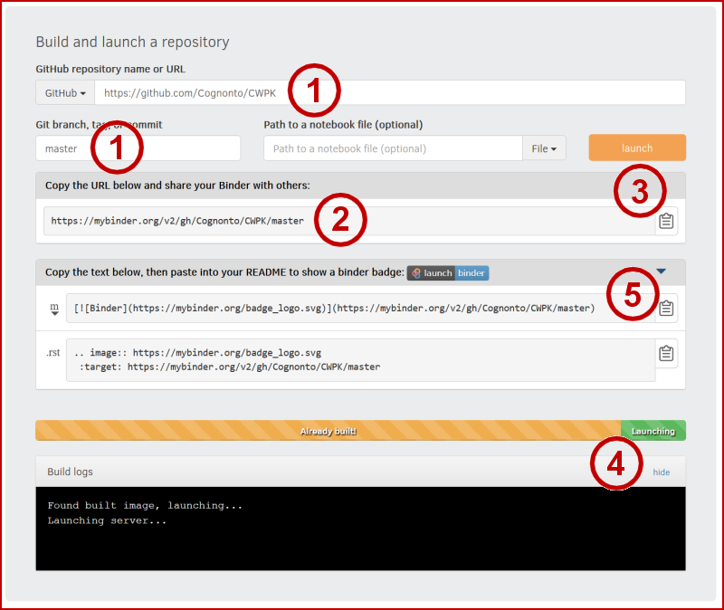
I am at best an amateur with Python. There are likely more efficient methods for coding these steps than what I provide. I encourage you to experiment — which is part of the fun of Python — and to notify me should you make improvements.

Posted by AI3's author, Mike Bergman Posted on October 14, 2020 at 11:26 am in CWPK, KBpedia, Semantic Web Tools | Comments (0)
The URI link reference to this post is: https://www.mkbergman.com/2400/cwpk-53-intro-to-other-tools/
The URI to trackback this post is: https://www.mkbergman.com/2400/cwpk-53-intro-to-other-tools/trackback/