It’s Time for Some Pretty Figures and Charts
It is time in our Cooking with Python and KBpedia series to investigate some charting options for presenting data or output. One of the remarkable things about Python is the wealth of add-on packages that one may employ, and visualization is no exception.
What we will first do in this installment is to investigate some of the leading charting options in Python sufficient for us to make an initial selection. We want nice looking output that is easily configured and fed with selected data. We also want multiple visualization types perhaps to work from the same framework, so that we need not make single choices, but multiple ones for multiple circumstances as our visualization needs unfold.
We will next tailor up some datasets for charting. We’d like to see a distribution histogram of our typlogies. We’d like to see the distribution of major components in the system, notably classes, properties, and mappings. We’d like to see a distribution of our notable links (mappings) to external sources. And, we’d like to see the interactive effect of our disjointedness assignments between typologies. The first desires can be met with bar and pie charts. the last with some kind of interaction matrix. (We investigate the actual knowledge graph in the next CWPK installment.)
We also want to learn how to take the data as it comes to us to process into a form suitable for visualization. Naturally, since we are generating many of these datasets ourselves, we could alter the initial generating routines in order to more closely match the needs for visualization inputs. However, for now, we will take our existing outputs as is, since that is also a good use case for wrangling wild data.
Review of Visualization Options
For quite a period, my investigation of Python visualization options had been focused on individual packages. I liked the charting output of options like Seaborn and Bokeh, and knew that Matplotlib and Plotly had close ties with Jupyter Notebook. I had previously worked with JavaScript visualization toolkits, and liked their responsiveness and often interactivity. On independent grounds, I was quite impressed with the D3.js library, though I was still investigating the suitability of that to Python. Because CWPK is a series that focuses on Python, though, I had some initial prejudice to avoid JS-dominated options. I also had spent quite a bit of time looking at graph visualization (see next installment), and had some concerns that I was not yet finding a package that met my desired checklist.
As I researched further, it was clear there were going to be trade-offs when picking a single, say, charting and then graphing package. It was about this time I came across the PyViz ecosystem. (Overall helpful tools listing: https://pyviz.org/tools.html.) PyViz is nominally the visualization complement to the broader PyData community.
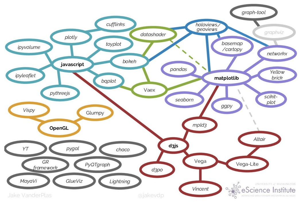
Jake VanderPlas pulled together a nice overview of the Python visualization landscape and how it evolved for a presentation to PyCon in 2017. Here is the summary diagram from his talk:
Source: Jake VanderPlas, “Python’s Visualization Landscape,” PyCon 2017, https://speakerdeck.com/jakevdp/pythons-visualization-landscape-pycon-2017
The trend in visualization for quite a few years has been the development of wrappers over more primitive drawing programs that abstract and make the definition of graphs and charts much easier. As these higher-level libraries have evolved they have also come to embrace multiple lower-level packages under their umbrellas. The trade-off in easier definitions of visualization objects is some lack of direct control over the output.
Because of the central role of Jupyter Notebooks in this CWPK series, and not having a more informed basis for making an alternative choice, I chose to begin our visualization efforts with Holoviews, which is an umbrella packaging over the applications as shown in the figure above. Bokeh provides a nice suite of interactive plotting and figure types. NetworkX (which is used in the next installment) has good network analysis tools and links to network graph drawing routines. And Matplotlib is another central hub for various plot types, many other Python visualization projects, color palettes, and NumPy.
Getting Started
Like most Python packages, installation of Holoviews is quite straightforward. Since I also know we will be using the bokeh plot library, we include it as well when installing the system:
conda install -c pyviz holoviews bokeh
Generating the First Chart
The first chart we want to tackle is the distribution of major components in KBpedia, which we will visualize with a pie chart. Statistics from our prior efforts (see the prior CWPK #54) and what is generated in the Protégé interface provide our basic counts. Since the input data set is so small, we will simply enter it directly into the code. (Later examples will show how we load CSV data using pandas .)
For the pie chart we will be using, we pick the bokeh plotting package. In reviewing code samples across the Web, we pick one example and modify it for our needs. I will explain key aspects of this routine after the code listing and chart output:
import panel as pn
pn.extension()
from math import pi
import pandas as pd                                                                   # Note 1

from bokeh.palettes import Accent
from bokeh.plotting import figure
from bokeh.transform import cumsum

a = {                                                                                 # Note 2
    'Annotation': 759398,
    'Logical': 85333,
    'Declaration': 63229,
    'Other': 8274
}

data = pd.Series(a).reset_index(name='value').rename(columns={'index':'axiom'})
data['angle'] = data['value']/data['value'].sum() * 2*pi
data['color'] = Accent[len(a)]

p = figure(plot_height=350, title='Axioms in KBpedia', toolbar_location=None,         # Note 3
           tools='hover', tooltips='@axiom: @value', x_range=(-0.5, 1.0))

r = p.wedge(x=0, y=1, radius=0.4,
        start_angle=cumsum('angle', include_zero=True), end_angle=cumsum('angle'),    # Note 4
        line_color='white', fill_color='color', legend_field='axiom', source=data)

p.axis.axis_label=None                                                                # Note 5
p.axis.visible=False
p.grid.grid_line_color = None

bokeh_pane = pn.pane.Bokeh(p)
bokeh_pane                                                                            # Note 6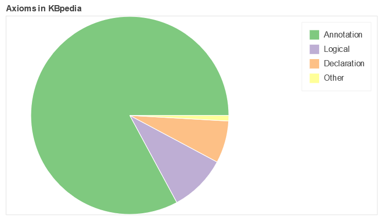
As with our other special routines, we begin by importing the new packages that are required for the pie chart (1). One of the imports, pandas, gives us very nice ways to relate an input CSV file or entered data to pick up item labels (rows) and attributes (col). Another notable import is to pick the color palette we want to use for our figure.
As noted, because our dataset is so small, we just enter it directly into the routine (2). Note how data entry conforms to the Python dictionary format of key:value pairs. Our data section also provides how we will convert the actual numbers of our data into segment slices in the pie chart, as well as defines for us the labels to be used based on pandas’ capabilities. We also indicate how many discrete colors we wish to use from the Accents palette. (Palettes may be chosen based on a set of discrete colors over a given spectrum, or, for larger data sets, picked as an increment over a continuous color spectrum. See further Additional Documentation below.)
The next two parts dictate how we format the chart itself. The first part sets the inputs for the overall figure, such as size, aspect, title, background color and so forth ((3)). We can also invoke some tools at this point, including the useful ‘hover’ that enables us to see actual values or related when mousing over items in the final figure. The second part of this specification guides the actual chart type display, ‘wedge’ in this case because of our choice of a pie chart (4). To see the various attributes available to us, we can invoke the standard dir() Python function:
dir(p)We continue to add the final specifications to our figure (5) and then invoke our function to render the chart (6).
We can take this same pattern and apply new data on the distribution of properties within KBpedia according to our three major types, which produces this second pie chart, again following the earlier approach:
prop = {
    'Object': 1316,
    'Data': 802,
    'Annotation': 2919
}

data = pd.Series(prop).reset_index(name='value').rename(columns={'index':'property'})
data['angle'] = data['value']/data['value'].sum() * 2*pi
data['color'] = Accent[len(prop)]

p = figure(plot_height=350, title="Properties in KBpedia", toolbar_location=None,
           tools="hover", tooltips="@property: @value", x_range=(-0.5, 1.0))

r = p.wedge(x=0, y=1, radius=0.4,
        start_angle=cumsum('angle', include_zero=True), end_angle=cumsum('angle'),
        line_color="white", fill_color='color', legend_field='property', source=data)

p.axis.axis_label=None
p.axis.visible=False
p.grid.grid_line_color = None

bokeh_pane = pn.pane.Bokeh(p)
bokeh_pane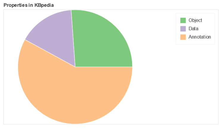
More Complicated Datasets
The two remaining figures in this charting installment use a considerably more complicated dataset: an interaction matrix of the SuperTypes (STs) in KBpedia. There are more than 70 STs under the Generals branch in KBpedia, but a few of them are very-high level (Manifestations, Symbolic, Systems, ConceptualSystems, Concepts, Methodeutic, KnowledgeDomains), leaving a total of about 64 that have potentially meaningful interactions. If we assume that interactions are transitive, that gives us a total of 2016 possible pairwise combinations among these STs ((N * N-1)/2).
From a substantive standpoint, some interactions are nearly global such as for Predications (including AttributeTypes, DirectRelations, and RepresentationTypes, specifically incorporating AdjunctualAttributes, ContextualAttributes, IntrinsicAttributes, CopulativeRelations, MediativeRelations, Associatives, Denotatives, and Indexes), and about 70 pair interactions are with direct parents. When we further remove these potential interactions, we are left with about 50 remaining STs, representing a final set of 1204 ST pairwise interactions.
Of this final set, 50% (596) are completely disjoint, 646 are disjoint to max 0.5%, and only 355 (30%) have overlaps exceeding 10%.
There are two charts we want to produce from this larger dataset. The first is a histogram of the distribution of STs as measured by number of reference concepts (RCs) each contains, and the second is a heatmap of the ST interactions that meaningfully participate in disjoint assertions.
In getting the basic input data into shape, it would have been possible to rely on many standard Python packages geared to data wrangling, but the fact is that a dataset of even this size can perhaps be more effectively and quickly manipulated in a spreadsheet, which is how I approached these sets. The trick to large-scale sorts and manipulations of such data in a spreadsheet is to create temporary columns or rows in which unique sequence numbers are designed (with the numbers being calculated from a formula such a new cell ID = prior cell ID + 1), copy the formulas as values, and then include these temporary rows or columns in the global (named) block that contains all of the data. One can then do many manipulations of the data matrix and still return to desired organization and order by sorting again on these temporary sequence numbers.
Histogram Distribution of STs by RCs
Let’s first begin, then, with the routine for displaying our SuperTypes (STs) according to their count of reference concepts (RCs). We import our needed Python packages, including a variety of color palettes, and reference our source input file in CSV format. Note we are reading this input file into pandas, which we invoke in order to see the input data (ST by RC count):
import pandas as pd
from bokeh.plotting import figure, output_notebook, show, ColumnDataSource
from bokeh.models.tools import HoverTool
from bokeh.transform import factor_cmap
from bokeh.palettes import viridis, magma, Turbo256, linear_palette

output_notebook()

src = r'C:\1-PythonProjects\kbpedia\v300\extractions\data\supertypes_counts.csv'
# on MyBinder, find at: CWPK/sandbox/extracts/data/

df = pd.read_csv(src)

df
Again using pandas, we are able to relate our column data to what will be displayed in the final figure:
supertypes = df['SuperTypes']
rcs = df['RCs']

supertypes
As with our previous figures, we have to input our settings for both the overall figure and the plot type (horizontal bar, in this case):
p = figure(y_range=supertypes,
           title = 'Counts by Disjoint KBpedia SuperTypes',
           x_axis_label = 'RC Counts',
           plot_width = 800,
           plot_height = 600,
           tools = 'pan,box_select,zoom_in,zoom_out,save,reset'
           )

p.hbar(y = supertypes,
       right = rcs,
       left = 0,
       height = 0.4,
       color = 'orange',
       fill_alpha = 0.5
       )

show(p)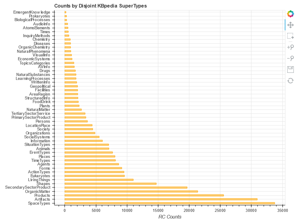
This shows the ease of working directly with pandas dataframes. But, there is a built-in function called ColumnDataSource that gives us some additional flexibility:
source = ColumnDataSource(df)

st_list = source.data['SuperTypes'].tolist()

p2 = figure(y_range = st_list,                              # Note the change of source here
            title = 'Counts by Disjoint KBpedia SuperTypes',
            x_axis_label = 'RC Counts',
            plot_width = 800,
            plot_height = 600,
            tools = 'pan,box_select,zoom_in,zoom_out,save,reset'
           )

p2.hbar(y = 'SuperTypes',
        right = 'RCs',
        left = 0,
        height = 0.4,
        color = 'orange',
        fill_alpha = 0.5,
        source=source                                      # Note the additional source
       )

hover = HoverTool()

hover.tooltips = """
    <div>
        <div><strong>SuperType: </strong>@SuperTypes</div>
        <div><strong>RCs: </strong>@RCs</div>
    </div>
"""
p2.add_tools(hover)

show(p2)
Next, we want to add a palette. After trying the variations first loaded, we choose Turbo256 and tell the system the number of discrete colors desired:
mypalette = linear_palette(Turbo256,50)

p2.hbar(y = 'SuperTypes',
        right = 'RCs',
        left = 0,
        height = 0.4,
        fill_color = factor_cmap(
               'SuperTypes',
               palette = mypalette,
               factors=st_list
               ),
        fill_alpha=0.9,
        source=source
)

hover = HoverTool()

hover.tooltips = """
    <div>
        <div><strong>SuperType: </strong>@SuperTypes</div>
        <div><strong>RCs: </strong>@RCs</div>
    </div>
"""
p2.add_tools(hover)

show(p2)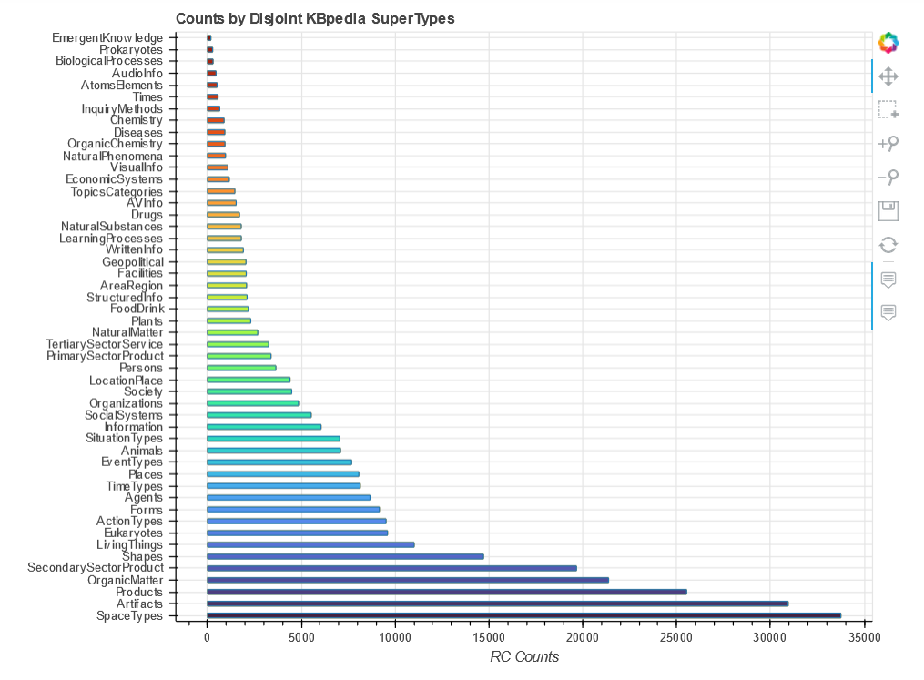
This now achieves the look we desire, with the bars sorted in order and a nice spectrum of colors across the bars. We also have hover tips that provide the actual data for each bar. The latter is made possible by the ColumnDataSource where we replace the standard ‘dict’ format into x, y.
Since we continue to gain a bit more tailoring and experience with each chart, we decide it is time to tackle the heatmap.
Heatmap Display
A heatmap is an interaction matrix. In our case, what we want to display are the SuperTypes that have some degree of disjointedness plotted against one another, with the number of RCs in x displayed against the RCs within y. Since, as the previous horizontal bar chart shows, we have a wide range of RC counts by SuperType, to normalize these interactions we decide to express the overlap as a percentage.
We again set up our imports and figure as before. If you want to see the actual data input file and format, invoke df_h as we did before:
import holoviews as hv
from holoviews import opts
hv.extension('bokeh', 'matplotlib')
import pandas as pd
import matplotlib

src = r'C:\1-PythonProjects\kbpedia\v300\extractions\data\st_heatmap.csv'
# on MyBinder, find at: CWPK/sandbox/extracts/data/

df_h = pd.read_csv(src)

heatmap = hv.HeatMap(df_h, kdims=['ST 1(x)', 'ST 2(y)'], vdims=['Rank', 'Overlap', 'Overlap/ST 1',
                    'ST 1 RCs', 'ST 2 RCs'])

color_list = ['#555555', '#CFCFCF', '#C53D4D', '#D14643', '#DC5039', '#E55B30',
           '#EB6527', '#F0701E', '#F47A16', '#F8870D', '#FA9306', '#FB9E07',
           '#FBAC10', '#FBB91E', '#F9C52C', '#F6D33F', '#F3E056', '#F1EB6C',
           '#F1EE74', '#F2F381', '#F3F689', '#F5F891', '#F6F99F', '#F7FAAC',
           '#F9FBB9', '#FAFCC6', '#FCFDD3', '#FEFFE5']

# for color_list, see https://stackoverflow.com/questions/21094288/convert-list-of-rgb-codes-to-matplotlib-colormap

my_cmap = matplotlib.colors.ListedColormap(color_list, name='interact')

heatmap.opts(opts.HeatMap(tools=['hover'], cmap=my_cmap, colorbar=True, width=960,
                          xrotation=90, height=960, toolbar='above', clim=(0, 26)))

heatmap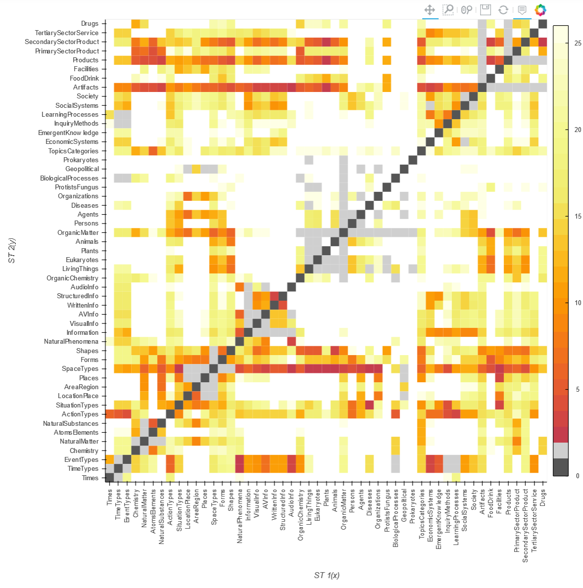
All of the available palettes did not have a color spectrum we liked, plus we needed to introduce the dark gray color (where an ST is being mapped to itself and therefore needs to be excluded). Another exclusion (light gray) is to remove ST interactions with anything in its parental lineage.
As for useful interactions, we wanted a close to smooth distribution of overlap intensities across the entire spectrum of 0% overlap (no color, white) to more than 95% (dark red). We achieve this distribution by not working directly from the percentage overlap figures, but by the mapping of thse percentage overlaps to a more-or-less smooth ranking assignment from roughly 0 to 30. It is the rank value that determines the color of the interaction cell.
There are clearly many specifics that may set and tweaked for your own figures. The call below is one example of how to get explanation of these settings.
hv.help(hv.HeatMap)Additional Documentation
- https://pandas.pydata.org/Pandas_Cheat_Sheet.pdf
- https://medium.com/@deallen7/visualizing-data-with-pythons-bokeh-package-310315d830bb
- https://medium.com/@deallen7/visualizing-data-with-pythons-bokeh-package-310315d830bb
- https://realpython.com/python-data-visualization-bokeh/
- https://coderzcolumn.com/tutorials/data-science/interactive-plotting-in-python-using-bokeh
Colors and Palettes
- https://towardsdatascience.com/jupyter-is-the-new-excel-but-not-for-your-boss-d24340ebf314
- https://docs.bokeh.org/en/latest/docs/user_guide/styling.html
- https://docs.bokeh.org/en/latest/docs/reference/palettes.html
- https://jiffyclub.github.io/palettable/matplotlib/
Charting
What to chart?
- https://github.com/bokeh/bokeh
- https://github.com/mwaskom/seaborn
- https://github.com/Ganesh1238/superset
- https://towardsdatascience.com/jupyter-superpower-interactive-visualization-combo-with-python-ffc0adb37b7b
- https://blog.magrathealabs.com/choosing-one-of-many-python-visualization-tools-7eb36fa5855f
- https://towardsdatascience.com/pyviz-simplifying-the-data-visualisation-process-in-python-1b6d2cb728f1
- plot.ly
- http://holoviews.org/user_guide/Styling_Plots.html
Heatmaps
- https://stackoverflow.com/questions/55240460/hvplot-heatmap-with-pandas-dataframe-how-to-specify-value-dimensions
- https://docs.bokeh.org/en/latest/docs/user_guide/categorical.html#heat-maps
- https://docs.bokeh.org/en/latest/docs/gallery/unemployment.html
- http://holoviews.org/reference/elements/bokeh/HeatMap.html
Other
- https://blog.algorexhealth.com/2017/09/10-heatmaps-10-python-libraries/
- http://holoviews.org/reference/index.html
- Gallery by application
- Gallery by chart types
- First diagram is dynamite
- https://github.com/pyviz-demos?language=jupyter+notebook
- https://github.com/jupyter-widgets/tutorial
- https://holoviz.org/tutorial/.
*.ipynb file. It may take a bit of time for the interactive option to load.


