zLinks Kicks Out an Old Favorite
 The issue of popups, thumbnails, link indicators, and other visual clues for blog content has been an interesting and difficult one. When Snap first came out with its preview popup thumbnails of referenced links (“Snap Shots“), it became all the rage until there was a backlash against ‘popupitis‘.
Similarly, many of us, for styling and design considerations (perhaps not always for the best?!), have mucked around with our CSS to the point that a standard link is sometimes hard to discern. You’ve seen them, and I have myself been guilty:
- different link colors than the original Web 1.0 link blue,
- sometimes no underlining,
- sometimes dotted underlines,
- even boxes, and (horrors!)
- even upper and lower borders!
As we get clever on this, we then need to compensate with other visual clues for the link.
In my case, about a year ago I adopted the terrific Link Indication WordPress plug-in by Michael Woehrer, which enabled me to type-by-icon the kind of link you, the reader, sees. In my own case, I had icons (for example) for Wikipedia, PDFs, RDF, general external links and some others. The idea, of course, is that faithful readers would learn these subtle distinctions and appreciate the visual cues. (Now for the obligatory, yeah, right!)
To avert symptoms similar to popupitis, it is important to keep these visual cues subtle and (hopefully) unobtrusive. I was actually fairly proud of my Link Indication icons in this regard.
zLinks Raises the Link to the ‘Power of Z’
I then began playing with zLinks about two weeks ago, and wrote a blog posting about it. Check that out and the update blog notice from Fred Giasson to learn more. And, if you have WordPress, you can download and install the plug-in yourself.
But now the game has changed. Instantaneously, my links became more meaningful, and my link representations on my blog more fat.
The links became more meaningful because now I had the wealth of linkages and relationships tied to every single embedded link on my writings. I have been an aggressive “linker” and this has meant a hidden wealth of interlinkages automatically available to my postings and writings. Sure, I don’t often or always want to explore this richness (and, maybe, many if not most of my readers don’t have that interest all the time as well), but, simply having it there has opened my eyes to what has been called ‘linked data.’
Further, the basis of relating a link to a MIME type or similar document-level distinction now seems primitive. The meaningful distinction is no longer whether the document is a Powerpoint or PDF, but what subjects it is about and who, what, where and when it describes. The link now becomes not a doorway to a document house, but a reference to individual rooms or objects therein.
This richness and its implications are only now becoming apparent to me (and in a still-forming way). Moreover, through such things as backlinks, directed connections, implied connections and many others, this now-emerging world of interconnectedness is still revealing itself.
The new branding of the Zitgist Browser Linker to zLinks, I think, is a nice acknowledgement by the developers that something fundamentally new is afoot. It has been exciting (and rewarding to me) that as one of the early users of this capability that the developers (Fred, especially, thanks!) have sought me out for input and ideas.
The enhancements in this most recent Zitgist release tell me we have truly entered the era of the ‘Power of Z.’ Namely, the reach of a zLinks link is to make real today’s basis to deliver data interconnectedness. This is not the future; it is today. And, it is profound and exciting.
A Diet is the Only Cure for Iconitis
So, with a breaking of document classification boundaries (such as MIME type) to one that is now attuned to atomic data, any imaginable classification scheme becomes possible. But in this open typing, how do we handle the poor, overburdened link? How do we convey its power and reach? We’d like to convey some meaning, but where does it end? Readability would never accept Dewey Decimal tags or literal metadata text or any other such construct appended to the standard link.
From a practical standpoint, my first challenge was including the standard zLinks “mini-Z” icon associated with the zLinks popup that is the entree point to all of this interlinkedness richness. (By the way, have you been mousing over these icons to see the cool zLinks popups? Let alone following those reference links to their own Zitgist template reports?) The problem was, here was another new and diverting icon on top of the ones I was using with Link Indication — in other words, my link representations were becoming fat.
To add insult to injury, when I, as blog author, need to annotate or make other local notes on my local zLinks capabilities, I also need to call up and deal with the zLinks annotation facility. And, it too, has its own icon. So, after installing zLinks, I found I was now suffering from a new disease, iconitis, that has symptoms dangerously close to popupitis.
Thus, here is what one of my links looked like with the standard Link Indication icon and the zlinks annotation and standard icons while in authoring mode:
My gawd, my links were getting as adorned with all manner of fruits and nuts worse than tutti frutti.
Since I am as much in authoring mode as not, this distraction is in my face about half of the time. So, my decision: Get ‘link lean’ — skinny down those link icons and references, sufficient to where things again become usable and readable.
It was time to say goodbye to Link Indication.
The Scope and Longer-term Paradigm Remains Unclear
There is really no need to make a heavy point of this except to note that the Web will continue to be ubiquitous as an access point to information, that information will devolve to be object- and data-centric and not at the document level, and the link (in keeping with its essence of the Web) will be the essential gateway for access.
I like the decisions Zitgist has made for zLinks: to provide a single, subtle and small icon, that itself brings up its own dialog showing the richness of the linked data support behind the embedded link. This popup is made available only when desired after a mouseover with a short delay (keeping the popup hidden during standard mouse movements). But then, when invoked, a new separate world of data types and links with expandable icons and tooltips is revealed:
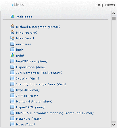
This richness can be shown in the following example zLinks popup for the embedded link to Sweet Tools, in which all 600 tools are made available from a single link! This scrollable and extensible design is very much in keeping with growth and potential and meaning for the once lowly link:

So, with zLinks, I and my readers may have now given up showing links by MIME type, but we have gained the power of complete connectedness with the Web.
Let’s all raise a toast to the ‘Power of Z’ and to keeping links lean!


